Demos

Please note that the ZipArchive extension must be installed and activated on your server for the demos to import correctly.
Install and activate the following plugins: Intense*, SMK Sidebar Generator*, LayerSlider, Slider Revolution, and WooCommerce. (*required)
Navigate to the Intensity Install Demos page.
Find the demo you wish to install and click Install to start importing the demo.
Wait for the installation to finish. It may take several minutes depending on the demo and connection speed. When complete, you will see a prompt telling you the demo has been imported.

Common Issues

Sorry, something unexpected occurred during installation.

This error is most likely due to your server environment settings. Typically the server execution time limit is too low or there isn’t enough memory available. Ask your host to increase the PHP max_execution_time and/or the memory_limit settings.

Duplicate Demo Content.

If you import the demo data more than once, there are a few things that may be duplicated. For the most part, this duplicate data can easily be cleaned up manually. To do so, locate the duplicate content and delete it from the system. For example, if you have multiple duplicated menu items, you would edit the menu and manually remove the items.

If you want to completely start over, you can use one of the following plugins:

Alternate Installation Method

WARNING: Installing the demos using the alternate method will entirely reset your database.
We have provided this alternate method to install the demos for those that are running into issues. At times, server configurations prevent the standard method from working. If you are having issues, installing the demos using the alternate method provides a good alternative.

Install and activate the theme and required plugins: Intense*, SMK Sidebar Generator*, LayerSlider, Slider Revolution, and WooCommerce. (*required)
Install and activate the All-in-One WP Migration plugin.
Navigate to the All-in-One WP Migration Import page.
Click the Import From button and select the demo file you have downloaded (see below for download links). You can also drag and drop the file within the upload box.
The file will be uploaded to your server and processed. Once done, you will see a prompt warning you about your database being overwritten. When ready, click the Continue button.
Wait for the installation to finish. When done, you will see a message letting you know that the import completed successfully. Click the Close button.
After the installation has finished, you will be logged out and will need to log back into the website. You will not be able to log back in with the users that you initially set up since the database has been reset. Use the following username and password to log in:

Username: admin Password: admin

After logging in, you can change the username and password to something more secure.

Alternate Demo Installation Downloads

Layout

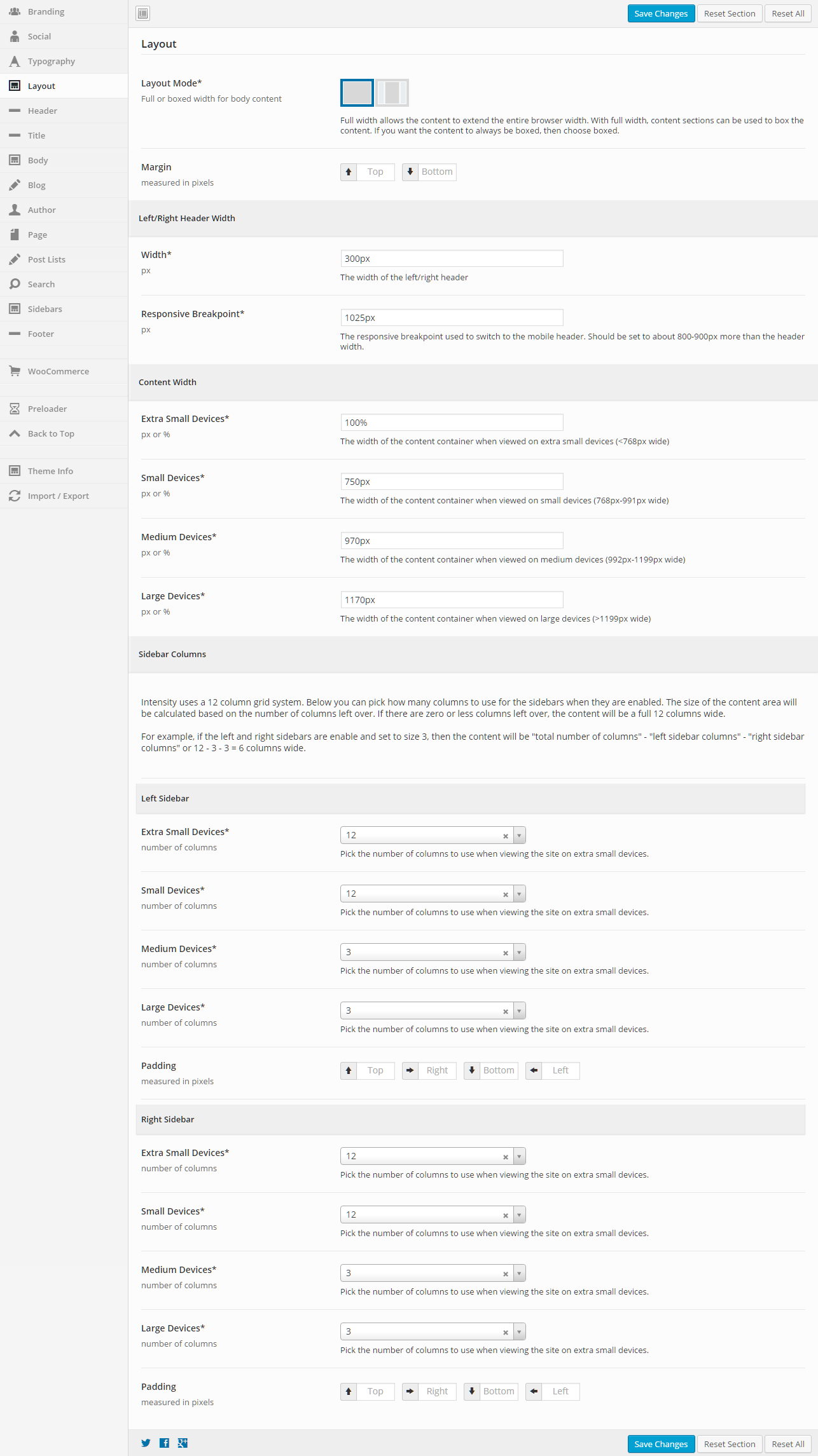
This section gives you the ability to control the layout of your website, including responsive breakpoints, content widths, margins, paddings, and sidebar widths.

General

Layout Mode
Full or boxed width for body content
Full width allows the content to extend the entire browser width. With full width, content sections can be used to box the content. If you want the content to always be boxed, then choose boxed.
Margin
Top – Set this option to add a top margin (measured in pixels)
Bottom – Set this option to add a bottom margin (measured in pixels)

Left/Right Header Width

Width (px)
The width of the left/right header (default is 300px)
Responsive Breakpoint (px)
The responsive breakpoint used to switch to the mobile header. Should be set to about 800-900px more than the header width (default is 1025px)

Content Width

Extra Small Devices (px or %)
The width of the content container when viewed on extra small devices (less than 768px wide)
Small Devices (px or %)
The width of the content container when viewed on small devices (768px to 991px wide)
Medium Devices (px or %)
The width of the content container when viewed on medium devices (992px to 1199px wide)
Large Devices (px or %)
The width of the content container when viewed on large devices (greater than 1199px wide)

Intensity uses a 12 column grid system. Below you can pick how many columns to use for the sidebars when they are enabled. The size of the content area will be calculated based on the number of columns left over. If there are zero or less columns left over, the content will be a full 12 columns wide.

For example, if the left and right sidebars are enabled and set to size 3, then the content will be “total number of columns” – “left sidebar columns” – “right sidebar columns” or 12 – 3 – 3 = 6 columns wide.

The following options are the same for both the right and left sidebars, so the options are only being listed once, but you can control both sidebars in Intensity.

Left/Right Sidebar

Extra Small Devices
Pick the number of columns to use when viewing the site on extra small devices.
Small Devices
Pick the number of columns to use when viewing the site on small devices.
Medium Devices
Pick the number of columns to use when viewing the site on medium devices.
Large Devices
Pick the number of columns to use when viewing the site on large devices.
Padding
Top – Set this option to add a top margin (measured in pixels)
Right- Set this option to add a right margin (measured in pixels)
Bottom – Set this option to add a bottom margin (measured in pixels)
Left – Set this option to add a left margin (measured in pixels)

Translations

Translating Intensity works like most plugins and themes. Within the theme zip file, you will find a folder called languages. This folder contains a file (intensity.po) that contains all the words and phrases used by Intensity. It will also contain existing translations. If your language isn’t already included, it will need to be translated.

To begin translating, make a copy of the intensity.po file but with the following name format: intensity-language_country.po. For example, if translating Intensity into Italian, the filename would be intensity-it_IT.po. The languages folder would look something like this:

languages
|-intensity.po
|-intensity.mo
|-intensity-it_IT.po
|-intensity-it_IT.mo

The .mo files are compiled versions of the .po files. They will automatically be created during the translation process. Once you have the language specific file created, you can begin translating. There are several programs that can be used to translate. We recommend using Poedit. Poedit is available for Windows, Macintosh, and Linux and is FREE!

To use Poedit, open the language file you are going to translate. Go through the individual source text items translating each one. If you want to only translate certain portions, you can still use an incomplete translation. We recommend translating at least the portions that will be visible to the users of your site. Make sure to save when you are done.

Once done translating, consider submitting your translation to info@intensevisions.com so that it can be included within future releases. If you wish, we will also give you credit for translating. If you don’t want to submit your translation, make sure to back it up when updating the theme so that it doesn’t get removed by the update.

Each update to the theme may include changes to the translation text and may need additional translation.

Also, make sure to enable your language in WordPress. This is done in the wp-config.php. See http://codex.wordpress.org/Installing_WordPress_in_Your_Language.

Header

This section gives you the ability to control nearly all things related to the header. You can choose the layout of the header, the template that is being used, and all sorts of color and border options.

General

Display Mode
Static – stays at the top of the page and not the viewport. When scrolled, the header may be scrolled out of view.
Fixed – keeps the header fixed to the top of the screen. When scrolled, the header will not move but will remain visible.
Show/Hide – hides the header when scrolling down. Show the header when the user scrolls up.
Shrink – shrinks the header and keeps it visible on the screen as the user scrolls.
Custom – like the show/hide option but you set your own custom CSS classes to apply instead of hiding and showing.
Show Animation
Set a “show” animation for the header. This animation will take place when the header is loaded.
Hide Animation
Set a “hide” animation for the header. This animation will take place when the header is hidden during scrolling. This applies to the “Show/Hide” display mode only.
Sections
Check each of the sections that you want to show in the header. Not all the sections may apply to all the header templates.
Columns
Set the number of columns you want the header to be. This may not apply to all the header templates.
Opacity
Set the opacity for the header. Default is 100 (0 is completely transparent, 100 is solid).
Scroll Opacity
Set this option to control the opacity of the header when visible and scrolling. This applies to the “Fixed” and “Shrink” display modes only.
Default is 95 (0 is completely transparent, 100 is solid).
Over Content Opacity
Set this option to control the opacity when the menu is set to be on top of the content.
Default is 80 (0 is completely transparent, 100 is solid).
Shadow
Set this option to add a shadow beneath the header. There are a number of shadows to choose from. The default is no shadow.

Primary Header – General

Template
This option allows you to select a template for the header. There are a number of templates included with Intensity, but you can also create your own. See Creating Content > Templates for more information.

Primary Header – Style

Background
This option allows the control of the header background. You can set the color, transparency, repeat, size, attachment, position, and image for the background of the header. More information on these settings can be found here.

Primary Header – Layout

Full or Boxed
Full or boxed width for header content
Full width allows the content to extend the entire browser width. With full width, content sections can be used to box the content. If you want the content to always be boxed, then choose boxed.
Padding
Top – Set this option to add a top padding (measured in pixels)
Right- Set this option to add a right padding (measured in pixels)
Bottom – Set this option to add a bottom padding (measured in pixels)
Left – Set this option to add a left padding (measured in pixels)
Logo Margin
Top – Set this option to add a top margin (measured in pixels)
Right- Set this option to add a right margin (measured in pixels)
Bottom – Set this option to add a bottom margin (measured in pixels)
Left – Set this option to add a left margin (measured in pixels)
Navigation Margin
Top – Set this option to add a top margin (measured in pixels)
Right- Set this option to add a right margin (measured in pixels)
Bottom – Set this option to add a bottom margin (measured in pixels)
Left – Set this option to add a left margin (measured in pixels)

Primary Header – Border

Top
Set the different values for the border: the height in pixels, the type of border (solid, dotted, etc…), and the color
Bottom
Set the different values for the border: the height in pixels, the type of border (solid, dotted, etc…), and the color
Divider
Set the different values for the border: the height in pixels, the type of border (solid, dotted, etc…), and the color
A few of the header templates contain a divider to separate menus or other areas. This setting applies to that divider

Primary Header – Menu

Mobile Responsive
This option controls the mobile responsiveness of the menu. Turn this option on if you want the menu to be mobile responsive and off if you do not.
Icon Before
Set the icon if you want an icon to show in the menu, before each menu item.
Select an Icon Source, then the Icon Type will be populated.
Icon Before Parents Only
Set this option if you want the icon that is set for “Icon Before” above to only be shown for parent menu items.
Icon After
Set the icon if you want an icon to show in the menu, after each menu item.
Select an Icon Source, then the Icon Type will be populated.
Icon After Parents Only
Set this option if you want the icon that is set for “Icon After” above to only be shown for parent menu items.

Primary Header – Top Level

Padding
Top – Set this option to add a top padding (measured in pixels)
Right- Set this option to add a right padding (measured in pixels)
Bottom – Set this option to add a bottom padding (measured in pixels)
Left – Set this option to add a left padding (measured in pixels)
Margin
Top – Set this option to add a top margin (measured in pixels)
Right- Set this option to add a right margin (measured in pixels)
Bottom – Set this option to add a bottom margin (measured in pixels)
Left – Set this option to add a left margin (measured in pixels)
Hover Font Color
Set the hover font color for when you hover over a top level menu item.
Hover Background Color
Set the hover background color for when you hover over a top level menu item.
Active Font Color
Set the active font color for the active menu item.
Active Background Color
Set the active background color for the active menu item.
Active Hover Font Color
Set the active hover font color for when you hover over the active menu item.
Active Hover Background Color
Set the active hover background color for when you hover over the active menu item.
Border
Set a border on top, right, bottom, or left along with style (dotted, dashed, etc…) and color for the top level menu.
Hover Border
Set a border on top, right, bottom, or left along with style (dotted, dashed, etc…) and color for when you hover over the top level menu.

Primary Header – Secondary Level

Hover Font Color
Set the hover font color for when you hover over a secondary level menu item.
Hover Background Color
Set the hover background color for when you hover over a secondary level menu item.

Secondary Header – General

Template
This option allows you to select a template for the secondary header. There are a number of templates included with Intensity, but you can also create your own. See Creating Content > Templates for more information.

Secondary Header – Style

Background
This option allows the control of the secondary header background. You can set the color, transparency, repeat, size, attachment, position, and image for the background of the secondary header. More information on these settings can be found here.

Secondary Header – Layout

Full or Boxed
Full or boxed width for header content
Full width allows the content to extend the entire browser width. With full width, content sections can be used to box the content. If you want the content to always be boxed, then choose boxed.
Padding
Top – Set this option to add a top padding (measured in pixels)
Right- Set this option to add a right padding (measured in pixels)
Bottom – Set this option to add a bottom padding (measured in pixels)
Left – Set this option to add a left padding (measured in pixels)

Secondary Header – Border

Top
Set the different values for the border: the height in pixels, the type of border (solid, dotted, etc…), and the color
Bottom
Set the different values for the border: the height in pixels, the type of border (solid, dotted, etc…), and the color

Widgets

Widgets allow you to add customizable content to different sections of your website. Widgets can be added to sidebars. Typically, sidebars can be found on the right or left of your website. Intensity also defines a few other “sidebar” areas you can use to add widgets to your site. Some of these areas include the footer, header, and before or after the content of your page. Intensity lets you add an unlimited number of sidebars that can be customized on a per page basis as needed.

Widgets vs Sidebars

It is important to understand the difference between the widgets and sidebars.

Widgets are small blocks of content that can be added to the sidebars. WordPress comes with several built-in widgets such as: text block, archives, calendar, categories, meta, recent posts, etc. The widgets can be added to your sidebars on the Appearance Widgets page. The Intense plugin also comes bundled with several widgets such as: Ads, Facebook Page, Gallery, Snippet, Social Icons, Template, and Twitter. To use these widgets, they first need to be enabled in the Settings Intense Widgets settings tab.

Sidebars are areas on the website that hold widgets. Often sidebars are referred to as widget sections because they have been extended to appear in more areas than just the sidebars. Intensity includes several pre-defined widget sidebars. Generally you will add the widgets to these sidebars and they will appear throughout your site. You can also customize these on a per page basis by creating your own sidebar and using the meta options to set which sidebar will show instead of the default.

Sidebar Areas

Sidebar Description
Right The right most sidebar. It can be configured to appear on the right or the left of the screen but will always appear to the right of the left sidebar.
Left The left most sidebar. It can be configured to appear on the right or the left of the screen but will always appear to the left of the right sidebar.
Before Content This sidebar will show before the content of the page or post. It can be used for displaying ads, notices, or even creating entire pages.
After Content This sidebar will show after the content of the page or post. It can be used for displaying ads, notices, or even creating entire pages.
Header – 1 Some of the header templates allow for showing widgets. This sidebar will be the first within this type of header template.
Header – 2 Some of the header templates allow for showing widgets. This sidebar will be the second within this type of header template.
Header – 3 Some of the header templates allow for showing widgets. This sidebar will be the third within this type of header template.
Header – 4 Some of the header templates allow for showing widgets. This sidebar will be the fourth within this type of header template.
Footer – 1 Some of the footer templates allow for showing widgets. This sidebar will be the first within this type of footer template.
Footer – 2 Some of the footer templates allow for showing widgets. This sidebar will be the second within this type of footer template.
Footer – 3 Some of the footer templates allow for showing widgets. This sidebar will be the third within this type of footer template.
Footer – 4 Some of the footer templates allow for showing widgets. This sidebar will be the fourth within this type of footer template.
Error 404 – 1 The 404 error page allows for showing widgets. This can often be useful for making better use of your error page to capture the attention of your users. This is the first sidebar that will show on the error page.
Error 404 – 2 The 404 error page allows for showing widgets. This can often be useful for making better use of your error page to capture the attention of your users. This is the second sidebar that will show on the error page.
Error 404 – 3 The 404 error page allows for showing widgets. This can often be useful for making better use of your error page to capture the attention of your users. This is the third sidebar that will show on the error page.
Error 404 – 4 The 404 error page allows for showing widgets. This can often be useful for making better use of your error page to capture the attention of your users. This is the fourth sidebar that will show on the error page.

Creating Sidebars

If you want to create a different sidebar on a specific page or post, you can easily do so using the SMK Sidebar Generator plugin that is included with Intensity. Sidebars are created on the Appearance Sidebar Generator page. After they are created and you have added widgets to them, you can set the new sidebars to show within the Sidebar Options Tab or within the page/post meta options.

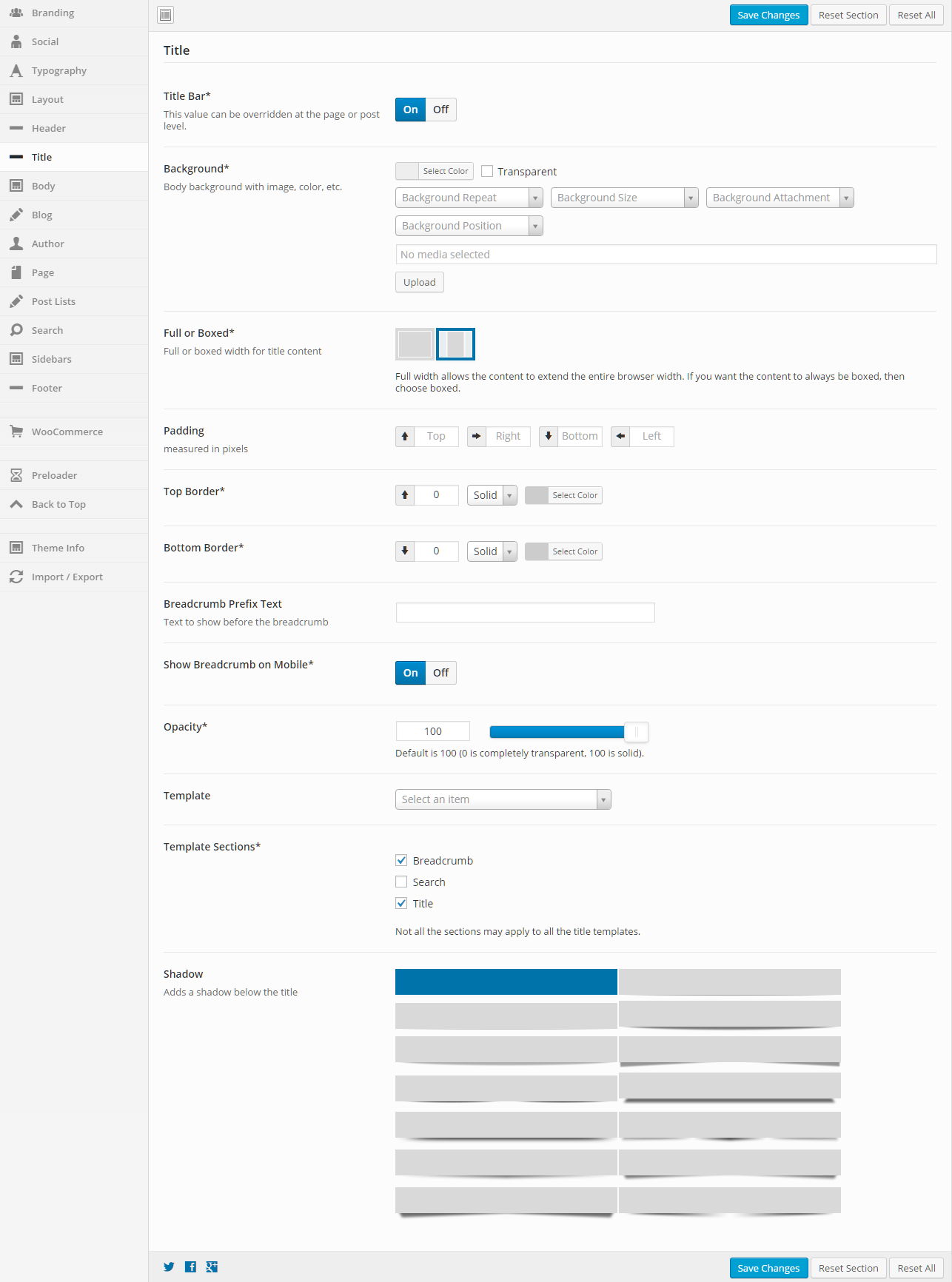
Title

This section gives you the ability to control nearly all things related to the title. You can choose the layout of the title, the template that is being used, and many other options.

General

Title Bar
Turn this option On to show the title bar and turn it Off to not show the title bar. This value can be overridden at the page or post level.
Background
This option allows the control of the title background. You can set the color, transparency, repeat, size, attachment, position, and image for the background of the title. More information on these settings can be found here.
Full or Boxed
Full or boxed width for header content
Full width allows the content to extend the entire browser width. With full width, content sections can be used to box the content. If you want the content to always be boxed, then choose boxed.
Padding
Top – Set this option to add a top padding (measured in pixels)
Right- Set this option to add a right padding (measured in pixels)
Bottom – Set this option to add a bottom padding (measured in pixels)
Left – Set this option to add a left padding (measured in pixels)
Top Border
Set the different values for the border: the height in pixels, the type of border (solid, dotted, etc…), and the color
Bottom Border
Set the different values for the border: the height in pixels, the type of border (solid, dotted, etc…), and the color
Breadcrumb Prefix Text
Set the text that will show before the breadcrumb. This might be a simple message that says “You are here” or something like that.
Show Breadcrumb on Mobile
If you want the breadcrumb to show on mobile devices, turn this option On, otherwise turn it Off.
Opacity
Set the opacity for the title. Default is 100 (0 is completely transparent, 100 is solid).
Template
This option allows you to select a template for the title. There are a number of templates included with Intensity, but you can also create your own. See Creating Content > Templates for more information.
Template Sections
Check each of the sections that you want to show in the title. Not all the sections may apply to all the title templates.
Shadow
Set this option to add a shadow beneath the title. There are a number of shadows to choose from. The default is no shadow.

Intensity Changelog

Intensity | Responsive Multi-Purpose Theme – v1.2.3 (September 11, 2017)

* Added font size and hover color options for social media links in header and footer
* Added Open Graph meta tags for pages and posts
* Fixed a conflict with the preloader and the Autoptomize plugin
* Updated WooCommerce template files


Intensity | Responsive Multi-Purpose Theme – v1.2.2 (September 11, 2017)

* Updated Intense to version 2.9.0
* Updated Visual Composer to version 5.2.1
* Updated LayerSlider WP to version 6.5.8
* Updated Slider Revolution to version 5.4.5.2
* Fixed a typo in the branding settings
* Fixed compatibility issues with WooCommerce 3.0.9


Intensity | Responsive Multi-Purpose Theme – v1.2.1 (May 25, 2017)

* Fixed showing of nested categories in the breadcrumb
* Updated Intense to version 2.8.9
* Updated LayerSlider WP to version 6.5.1
* Updated Slider Revolution to version 5.4.5.1


Intensity | Responsive Multi-Purpose Theme – v1.2.0 (April 25, 2017)

* Updated Slider Revolution to version 5.4.3


Intensity | Responsive Multi-Purpose Theme – v1.1.9 (April 18, 2017)

* Updated Intense to version 2.8.8
* Updated LayerSlider WP to version 6.3.0
* Updated Slider Revolution to version 5.4.1
* Updated Visual Composer to version 5.1.1
* Fixed compatibility issues with WooCommerce 3.0+


Intensity | Responsive Multi-Purpose Theme – v1.1.8 (Feb 7, 2017)

* Updated Intense to version 2.8.7
* Updated LayerSlider WP to version 6.1.0
* Updated Slider Revolution to version 5.3.1.5
* Fixed PHP 7.1 related warnings
* Fixed an issue with the one column team template found in the agency child theme
* Fixed an issue with the two column text only content template found in the political child theme


Intensity | Responsive Multi-Purpose Theme – v1.1.7 (December 6, 2016)

* Updated Advanced Custom Fields (ACF) to the latest version (5.5.1)
* Updated Intense to version 2.8.5
* Updated LayerSlider WP to version 6.0.6
* Updated Slider Revolution to version 5.3.1
* Updated Visual Composer to version 5.0.1


Intensity | Responsive Multi-Purpose Theme – v1.1.6 (November 10, 2016)

* Fixed content section breakout issues with parallax background images
* Updated Advanced Custom Fields (ACF) to the latest version (5.4.8)
* Updated Intense to version 2.8.4
* Updated LayerSlider WP to version 6.0.5


Intensity | Responsive Multi-Purpose Theme – v1.1.5 (November 9, 2016)

* Fixed CSS link for dynamically created CSS files
* Updated LayerSlider WP to version 6.0.3
* Updated Slider Revolution to version 5.3.0.2


Intensity | Responsive Multi-Purpose Theme – v1.1.4 (October 14, 2016)

* Fixed an issue with the way preloader code handles download links
* Updated Intense to version 2.8.2
* Updated Redux Framework to the latest version (3.6.1.3)


Intensity | Responsive Multi-Purpose Theme – v1.1.3 (September 15, 2016)

* Fixed preloader so it doesn’t animate when triggered from the single attachment page or
when downloading a file
* Fixed some margin issues that caused horizontal scrollbars
* Fixed default logo url to use the website’s url if not set.
This also fixes an issue with qtranslate reverting to default language.
* Fixed a compatibility issue with upcoming WordPress version 4.7
* Updated WooCommerce templates
* Updated Intense to version 2.8.1
* Updated Visual Composer to version 4.12.1


Intensity | Responsive Multi-Purpose Theme – v1.1.2 (July 8, 2016)

* Updated LayerSlider WP to version 5.6.9
* Updated Slider Revolution to version 5.2.6
* Updated Visual Composer to version 4.12
* Updated Intense to version 2.8.0
* The above plugins were somehow not updated during packaging of version 1.1.1


Intensity | Responsive Multi-Purpose Theme – v1.1.1 (July 6, 2016)

* Added option to show/hide social links on post pages
* Added Alt Text option for the site logo image
* Added Background Color, Border, and Border Radius options for Secondary level menu
* Updated LayerSlider WP to version 5.6.9
* Updated Slider Revolution to version 5.2.6
* Updated Visual Composer to version 4.12
* Updated Intense to version 2.8.0
* Updated TGM Plugin Activation class to version 2.6.1


Intensity | Responsive Multi-Purpose Theme – v1.1.0 (May 31, 2016)

* Fixed an issue in Intense that was preventing installing of demos
* Updated Redux Framework to the latest version (3.6.0.5)
* Updated Slider Revolution to version 5.2.5.3
* Updated Intense to version 2.7.9


Intensity | Responsive Multi-Purpose Theme – v1.0.9 (May 26, 2016)

* Improved demo installation by separating out steps, improving feedback,
preventing the chance of conflicts with plugins, and adding the ability
to manually FTP upload the demo zip file to the server for installation
* Increased request timeouts for demo import
* Improved overall performance of admin screens
* Fixed issue with saving of template files created with the Templates CPT
* Updated LayerSlider WP to version 5.6.8
* Updated Slider Revolution to version 5.2.5.1
* Updated Intense to version 2.7.8


Intensity | Responsive Multi-Purpose Theme – v1.0.8 (May 3, 2016)

* Fixed broken demo import
* Removed global word-break styling
* Updated LayerSlider WP to version 5.6.6
* Improved overall performance of admin screens


Intensity | Responsive Multi-Purpose Theme – v1.0.7 (April 26, 2016)

* Updated Slider Revolution to version 5.2.5
* Updated Redux Framework to the latest version (3.6.0.1)
* Added child theme’s style.css as another way to add custom CSS
* Fixed menu styling and search button for page/post level saved header menus
* Improved overall performance


Intensity | Responsive Multi-Purpose Theme – v1.0.6 (April 13, 2016)

* Added Welcome tab to theme options to show links and plugins
* Added theme registration to receive automatic updates, support registration, forum access and more
* Added automatic updates. Users will need to manually update to version 1.0.6.
* Added new “Left menu without branding” header template
* Fixed “Branding on left with menu below” header template


Intensity | Responsive Multi-Purpose Theme – v1.0.5 (April 5, 2016)

* Fixed theme check issues
* Fixed bug in several templates when Intense isn’t enabled
* Fixed missing header animation option warning
* Removed unused intensity_after_closing_body action
* Removed Redux notices
* Removed forced activation/deactivation from TGMPA plugins
* Replaced dirname( __FILE__ ) with get_template_directory() in included plugins


Intensity | Responsive Multi-Purpose Theme – v1.0.4 (March 31, 2016)

* Moved wp_footer to just before closing body tag
* Changed site icon check from WP version to wp_site_icon function check
* Removed functions from header and footer templates
* Prefixed functions, actions, and more that weren’t prefixed
* Fixed data validation issues where dynamic data was not properly escaped
* Fixed divide-by-zero issue in multicolumn widget templates
* Replaced system calls for reading/writing files with WP_Filesystem methods
* Consolidated Intro Effect single post templates to reduce space


Intensity | Responsive Multi-Purpose Theme – v1.0.3 (March 22, 2016)

* Fixed importing of custom post types and saved templates
* Updated theme translatable strings so they are now properly escaped
* Removed use of basename() and dirname() functions


Intensity | Responsive Multi-Purpose Theme – v1.0.2 (March 14, 2016)

* Added support for full width mega menus
* Fixed main translation file changing it from .po/.mo to .pot version
* Removed SVG upload capability because it is a potential security risk
* Removed inline styles across templates and theme files
* Refactored code to remove use of global variables
* Refactored shrink header mode
* Omit closing PHP tag on some pages to avoid “Headers already sent” issues


Intensity | Responsive Multi-Purpose Theme – v1.0.1 (March 9, 2016)

* Added support for Easy Digital Downloads
* Added support for Gravity Forms
* Added support for BuddyPress
* Added ‘nogutter’ class to a couple post fullwidth templates
* Added Agency child theme
* Added Brewery child theme
* Added ability to use Template CPT to create Primary Footer and Secondary Footer templates
* Fixed circle image center alignment on one of the author templates
* Fixed a few font size issues


Intensity | Responsive Multi-Purpose Theme – v1.0.0 (February 20, 2016)

* Initial Release

Skins

Skins let you change the overall look of the shortcodes without changing the individual attribute values on the shortcode dialog. Skins make it easy to change the look of the shortcodes to match your site design. Also, if you change themes, you can change the skin and have all your existing shortcodes change as well without having to go to each page/post.

Another benefit of skins is they allow you to define alternate looks of your shortcodes. To do so you can create more than one skin and select which one to use on the shortcode dialog.

Saved Locations and Priority

There are two ways skins are saved. You can create skin files and save them within your theme or child theme. Skin files for themes should be placed within a intense_skins folder in the theme or child theme. An easy way to create a skin file is to export an existing skin and save it to the correct location.

Skins are also saved in the database. If you use the skin builder, any changes to skin file skins or new skins will be saved in the database. If you want to transfer the settings to a new installation, export the database skin and save it to a file.

There is a priority used to determine which skin to load. Skins with the same key will be loaded in the following priority ordered by highest priority:

  • Database
  • Child Theme
  • Theme
  • Intense Plugin

Skin Builder

The skin builder lists the individual shortcodes along with the ability to change the default attribute values. When using the skin builder, any changes you make to shortcode attributes will automatically be saved to the skin. Not all attributes are skinnable. Only the skinnable attributes will be shown.

Body

This section gives you the ability to control many aspects of the body and body content portion of your site.

General

Background
This option allows the control of the body background. You can set the color, transparency, repeat, size, attachment, position, and image for the background of the body. More information on these settings can be found here.
Padding
Top – Set this option to add a top padding (measured in pixels)
Right- Set this option to add a right padding (measured in pixels)
Bottom – Set this option to add a bottom padding (measured in pixels)
Left – Set this option to add a left padding (measured in pixels)

Content

Background
This option allows the control of the content background. You can set the color, transparency, repeat, size, attachment, position, and image for the background of the content. More information on these settings can be found here.
Navigation/Meta-data Border
Set the different values for the border: the height in pixels, the type of border (solid, dotted, etc…), and the color. This option allows you to set the top and bottom border height as well as the type and color.
Opacity
Set the opacity for the content. Default is 100 (0 is completely transparent, 100 is solid).

Templates

What Are Intense Templates?

Intense templates allow you to override the layout of a shortcode. If you don’t like the way the shortcode looks, you can change the html markup to suit your needs. Not all shortcodes are templated but most of the shortcodes with a lot of html are. If you are happy with the default look, there is no need to change the templates.

Where Are They?

Intense templates can exist in three different locations:

  • The Intense plugin – in the templates folder within the plugin’s main folder. THESE SHOULD NEVER BE CHANGED
  • The theme – in the intense_templates folder within the theme’s main folder.
  • The child theme – in the intense_templates folder within the child theme’s main folder.

The plugin will look for templates in the following order: the child theme, the theme, the plugin.

The download for this plugin includes a folder intense_templates which is a copy of the default templates found in the plugin folder.

How Do I Change Them?

To change the templates, copy the folder from the download to your child theme’s or theme’s main folder. At that point, you can edit the files and the plugin will use your edited version instead of the default version.

Can I Add My Own?

One way to add templates is through the templates admin page. You can add templates like you would any regular post or page. To do this, you will need to use the Post Fields shortcode. This shortcode allows you to add the fields to be displayed in the template. When the template is run, the shortcodes will know to find the appropriate fields for each post.
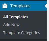
*Click the above image to view an example template setup to be used for the Book Custom Post Type.
You can add your own template file within the template folders. The file should include a header in the following format:
<?php
/*
Intense Template Name: [YOUR TEMPLATE NAME HERE]
*/
Templates Custom Post Type

If you are looking for information on the Templates Custom Post Type, please look in the Custom Post Types or click here.

What If I Need to Upgrade My Theme?

When you upgrade the Intensity theme, it is best to backup the template folder to a safe location. After upgrading, put your template files back into the theme from your backup. We strongly suggest using a child theme so that you do not have to worry about the templates folder being overwritten and your changes being lost.

Which Templates Are Available By Default?

Nearly all of the Custom Post Types that are included in Intense have templates available by default. You can also template metadata (author, date, and comments shown for posts in intense post shortcodes), pricing tables, recent posts, and testimonies to name a few.

Intensity includes a bunch of additional templates for the above mentioned Custom Post Types as well as a number of additional template-able items. These additional items include the header, footer, title bar, search, secondary header, and secondary footer. Intensity includes a number of templates for these items already, but we make it easy for you to add your own, or modify one of our existing ones.

Some Additional Information About Templates

[intense_custom_post] (including [intense_blog] & [intense_portfolio])

The templates for this shortcode are found under the custom-post directory. Standard post templates are under the post directory within the custom-post directory. Portfolio templates are found under the intense_portfolio directory. If you want to add your own templates for custom post types, create a directory under the custom-post directory with a name that matches the custom post type name. If there aren’t templates for a given custom post type, the default post templates will be used. The list below shows only some of the included templates that are available with the Intensity theme and the Intense plugin.

NOTE: Timeline templates must have timeline in their file name.

templates
|-custom-post
|–intense_portfolio
|—–four_text.php
|—–one.php
|—–one_text_left.php
|—–one_text_right.php
|—–three_text.php
|—–timeline.php
|—–timeline_text_left.php
|—–timeline_text_only.php
|—–timeline_text_right.php
|—–two_text.php
|–post
|—–four.php
|—–four_text.php
|—–one.php
|—–one_text_left.php
|—–one_text_right.php
|—–three.php
|—–three_text.php
|—–timeline.php
|—–timeline_text_left.php
|—–timeline_text_only.php
|—–timeline_text_right.php
|—–two.php
|—–two_text.php
|–some_other_custom_post_type
|—–your_own_template.php

The following data is available to the custom post templates:

global $post, $intense_custom_post;
———
$intense_custom_post
(
    [plugin_layout_style] => the padding and margin styles defined in the plugin options
    [cancel_plugin_layout_style] => 0 margin and padding used to cancel out plugin layout style
    [template] => template name
    [categories] => comma separated list of categories
    [post_type] => the post type to show
    [taxonomy] => the taxonomy of the posts
    [posts_per_page] => number of posts to show on a single page
    [image_shadow] => shadow to show on the post featured image
    [hover_effect] => hover effect of the featured image
    [show_all] => show all posts
    [show_filter] => show filter at top of post list
    [show_images] => show featured images
    [show_missing_image] => show missing image if no featured image has been set
    [timeline_mode] => timeline mode: center, left, right, dual
    [timeline_order] => order to the timeline events: asc, desc
    [timeline_showyear] => show the year separator
    [timeline_readmore] => text for read more link
    [timeline_color] => color of the timeline event
    [filter_easing] => easing when items filtered
    [filter_effects] => easing effect for filtered items
    [hover_effect_color] => color for image hover
    [hover_effect_opacity] => opacity for image hover
    [sticky_mode] => how to show sticky posts: top, inline, ignore
    [post_image_shadow] => defined in meta box
    [hovereffect] => defined in meta box
    [hovereffectcolor] => defined in meta box
    [hovereffectopacity] => defined in meta box
    [index] => index number of post in loop
    [edit_link] =>  html markup for post edit link
    [post_classes] => extra classes used for filtering and item setup
    [rtl] => rtl mode setting
)