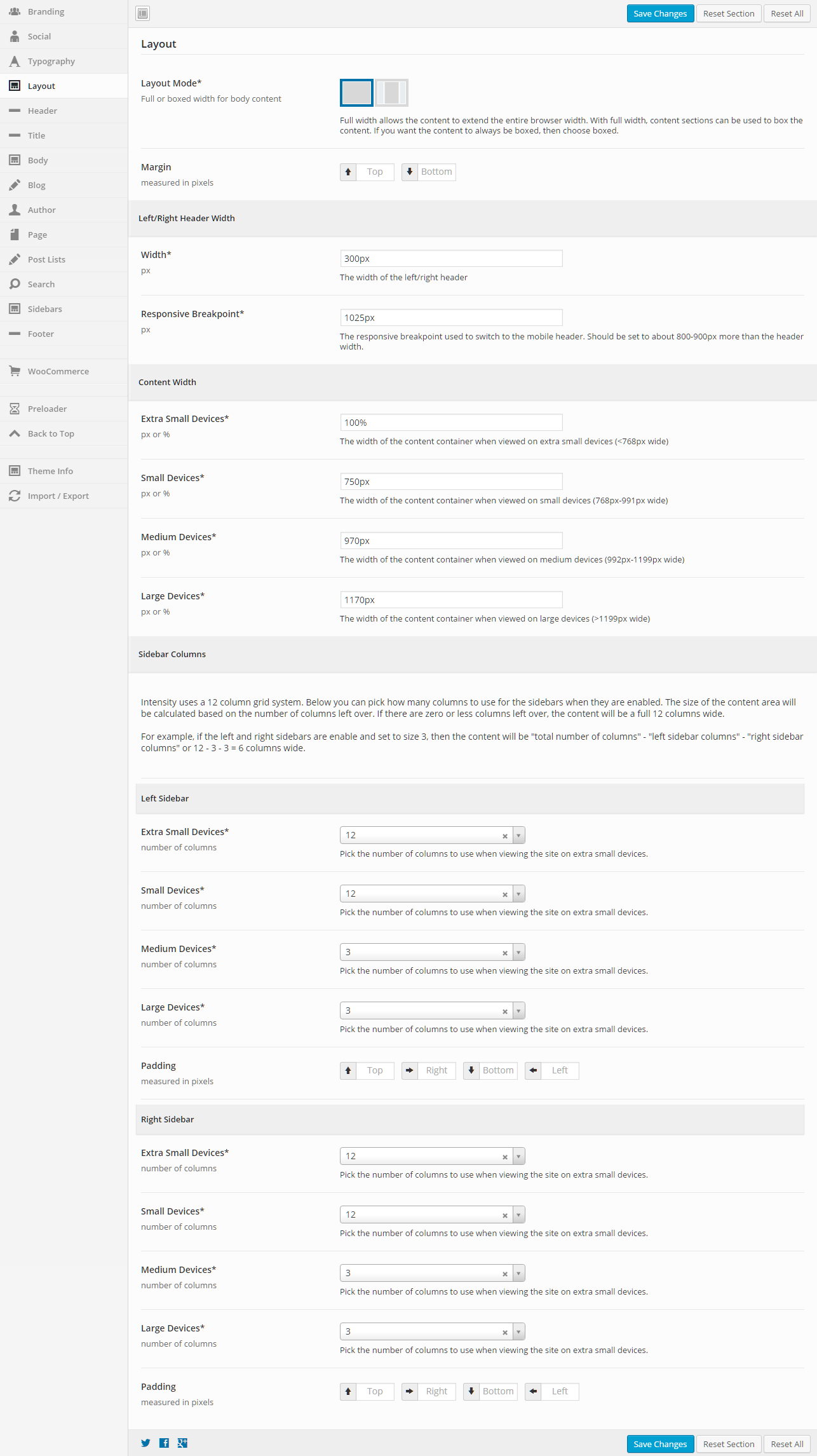
Layout
This section gives you the ability to control the layout of your website, including responsive breakpoints, content widths, margins, paddings, and sidebar widths.
General
Layout Mode
Full or boxed width for body content
Full width allows the content to extend the entire browser width. With full width, content sections can be used to box the content. If you want the content to always be boxed, then choose boxed.
Margin
Top – Set this option to add a top margin (measured in pixels)
Bottom – Set this option to add a bottom margin (measured in pixels)
Left/Right Header Width
Width (px)
The width of the left/right header (default is 300px)
Responsive Breakpoint (px)
The responsive breakpoint used to switch to the mobile header. Should be set to about 800-900px more than the header width (default is 1025px)
Content Width
Extra Small Devices (px or %)
The width of the content container when viewed on extra small devices (less than 768px wide)
Small Devices (px or %)
The width of the content container when viewed on small devices (768px to 991px wide)
Medium Devices (px or %)
The width of the content container when viewed on medium devices (992px to 1199px wide)
Large Devices (px or %)
The width of the content container when viewed on large devices (greater than 1199px wide)
Intensity uses a 12 column grid system. Below you can pick how many columns to use for the sidebars when they are enabled. The size of the content area will be calculated based on the number of columns left over. If there are zero or less columns left over, the content will be a full 12 columns wide.
For example, if the left and right sidebars are enabled and set to size 3, then the content will be “total number of columns” – “left sidebar columns” – “right sidebar columns” or 12 – 3 – 3 = 6 columns wide.
The following options are the same for both the right and left sidebars, so the options are only being listed once, but you can control both sidebars in Intensity.
Left/Right Sidebar
Extra Small Devices
Pick the number of columns to use when viewing the site on extra small devices.
Small Devices
Pick the number of columns to use when viewing the site on small devices.
Medium Devices
Pick the number of columns to use when viewing the site on medium devices.
Large Devices
Pick the number of columns to use when viewing the site on large devices.
Padding
Top – Set this option to add a top margin (measured in pixels)
Right- Set this option to add a right margin (measured in pixels)
Bottom – Set this option to add a bottom margin (measured in pixels)
Left – Set this option to add a left margin (measured in pixels)

