WordPress child themes allow you to apply custom changes to your site without the worry of your changes being deleted when the parent theme is updated. Continue reading if you would like to learn how to use or create a child theme.
While child themes are a great way to apply custom changes to Intensity (the parent theme), they are generally used to customize the core code of the parent theme. We cannot provide support for customizations of this kind, as they fall outside our scope of support and we will be unable to assist you with issues that may arise.
What Is A Child Theme
A child theme is a theme that inherits the functionality and styling of another theme, called the parent theme. Child themes are the recommended way of modifying an existing theme.Why Use A Child Theme
There are a few reasons why you would want to use a child theme:- If you modify a theme directly and it is updated, then your modifications may be lost. By using a child theme you will ensure that your modifications are preserved.
- Using a child theme can speed up development time.
- Using a child theme is a great way to learn about WordPress theme development.
Installing The Intensity Child Theme
You cannot install a child theme without the parent theme being installed, so make sure to install Intensity prior to installing the Intensity Child Theme. Open up your WordPress dashboard/admin, i.e (yourdomain.com/wp-admin) and login. On the right hand side click on “Appearance”, you should now have what looks like the screenshot below. As you can see in the screenshot below, there are a couple of “Add new theme” buttons, click either one. When you get to the screen that looks like the screenshot below, click on the “Upload Theme” button.
 When you get to the screen that looks like the screenshot below, click on the “Browse” button and find the Intensity Child Theme that you want to install. The download from ThemeForest includes a number of child themes for Intensity that you can install.
 Once you have selected the child theme that you want to install and the name is shown next to the “Browse” button, go ahead and click “Install” to start the installation of the child theme.
 When you get to the screen that looks like the screenshot below, the child theme has successfully been installed and now all you have to do is to click the “Activate” link to activate the child theme.
 Congratulations, you have successfully installed the Intensity child theme.
In the image below, the “Intensity Child Theme” is the current “Active” theme. The Parent theme, “Intensity”, is found just to the right of the child theme image. If you are looking to modify the core code of the Intensity theme, use the Intensity Child Theme to make your modifications.

Useful Documentation On Child Themes
If you’d like to learn more about child themes, check out the links below.WordPress Codex on Child Themes
How To Create A WP Child Theme video by WPBeginner.com
Navigate to the Intensity Install Demos page.
Find the demo you wish to install and click Install to start importing the demo.
Wait for the installation to finish. It may take several minutes depending on the demo and connection speed. When complete, you will see a prompt telling you the demo has been imported.

Common Issues
Sorry, something unexpected occurred during installation.
This error is most likely due to your server environment settings. Typically the server execution time limit is too low or there isn’t enough memory available. Ask your host to increase the PHP max_execution_time and/or the memory_limit settings.
If you import the demo data more than once, there are a few things that may be duplicated. For the most part, this duplicate data can easily be cleaned up manually. To do so, locate the duplicate content and delete it from the system. For example, if you have multiple duplicated menu items, you would edit the menu and manually remove the items.
If you want to completely start over, you can use one of the following plugins:
Alternate Installation Method
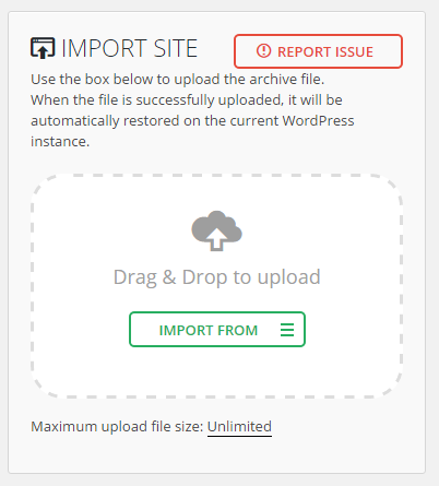
Install and activate the All-in-One WP Migration plugin.
Navigate to the All-in-One WP Migration Import page.
Click the Import From button and select the demo file you have downloaded (see below for download links). You can also drag and drop the file within the upload box.
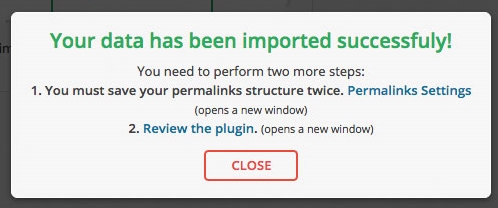
The file will be uploaded to your server and processed. Once done, you will see a prompt warning you about your database being overwritten. When ready, click the Continue button.
Wait for the installation to finish. When done, you will see a message letting you know that the import completed successfully. Click the Close button.
After the installation has finished, you will be logged out and will need to log back into the website. You will not be able to log back in with the users that you initially set up since the database has been reset. Use the following username and password to log in:
After logging in, you can change the username and password to something more secure.
Alternate Demo Installation Downloads

General
Position
Translating Intensity works like most plugins and themes. Within the theme zip file, you will find a folder called languages. This folder contains a file (intensity.po) that contains all the words and phrases used by Intensity. It will also contain existing translations. If your language isn’t already included, it will need to be translated.
To begin translating, make a copy of the intensity.po file but with the following name format: intensity-language_country.po. For example, if translating Intensity into Italian, the filename would be intensity-it_IT.po. The languages folder would look something like this:
languages
|-intensity.po
|-intensity.mo
|-intensity-it_IT.po
|-intensity-it_IT.mo
The .mo files are compiled versions of the .po files. They will automatically be created during the translation process. Once you have the language specific file created, you can begin translating. There are several programs that can be used to translate. We recommend using Poedit. Poedit is available for Windows, Macintosh, and Linux and is FREE!
To use Poedit, open the language file you are going to translate. Go through the individual source text items translating each one. If you want to only translate certain portions, you can still use an incomplete translation. We recommend translating at least the portions that will be visible to the users of your site. Make sure to save when you are done.
Once done translating, consider submitting your translation to info@intensevisions.com so that it can be included within future releases. If you wish, we will also give you credit for translating. If you don’t want to submit your translation, make sure to back it up when updating the theme so that it doesn’t get removed by the update.
Each update to the theme may include changes to the translation text and may need additional translation.
Also, make sure to enable your language in WordPress. This is done in the wp-config.php. See http://codex.wordpress.org/Installing_WordPress_in_Your_Language.

General
The Social and Custom Icon Options shown below apply to all of the following sections found on the Social tab.
- Google+
- RSS
- YouTube
- Custom 1
- Custom 2
- Custom 3
Social and Custom Icon Options

Import
Export
Widgets allow you to add customizable content to different sections of your website. Widgets can be added to sidebars. Typically, sidebars can be found on the right or left of your website. Intensity also defines a few other “sidebar” areas you can use to add widgets to your site. Some of these areas include the footer, header, and before or after the content of your page. Intensity lets you add an unlimited number of sidebars that can be customized on a per page basis as needed.
Widgets vs Sidebars
It is important to understand the difference between the widgets and sidebars.
Widgets are small blocks of content that can be added to the sidebars. WordPress comes with several built-in widgets such as: text block, archives, calendar, categories, meta, recent posts, etc. The widgets can be added to your sidebars on the Appearance Widgets page. The Intense plugin also comes bundled with several widgets such as: Ads, Facebook Page, Gallery, Snippet, Social Icons, Template, and Twitter. To use these widgets, they first need to be enabled in the Settings Intense Widgets settings tab.
Sidebars are areas on the website that hold widgets. Often sidebars are referred to as widget sections because they have been extended to appear in more areas than just the sidebars. Intensity includes several pre-defined widget sidebars. Generally you will add the widgets to these sidebars and they will appear throughout your site. You can also customize these on a per page basis by creating your own sidebar and using the meta options to set which sidebar will show instead of the default.
Sidebar Areas
| Sidebar | Description |
|---|---|
| Right | The right most sidebar. It can be configured to appear on the right or the left of the screen but will always appear to the right of the left sidebar. |
| Left | The left most sidebar. It can be configured to appear on the right or the left of the screen but will always appear to the left of the right sidebar. |
| Before Content | This sidebar will show before the content of the page or post. It can be used for displaying ads, notices, or even creating entire pages. |
| After Content | This sidebar will show after the content of the page or post. It can be used for displaying ads, notices, or even creating entire pages. |
| Header – 1 | Some of the header templates allow for showing widgets. This sidebar will be the first within this type of header template. |
| Header – 2 | Some of the header templates allow for showing widgets. This sidebar will be the second within this type of header template. |
| Header – 3 | Some of the header templates allow for showing widgets. This sidebar will be the third within this type of header template. |
| Header – 4 | Some of the header templates allow for showing widgets. This sidebar will be the fourth within this type of header template. |
| Footer – 1 | Some of the footer templates allow for showing widgets. This sidebar will be the first within this type of footer template. |
| Footer – 2 | Some of the footer templates allow for showing widgets. This sidebar will be the second within this type of footer template. |
| Footer – 3 | Some of the footer templates allow for showing widgets. This sidebar will be the third within this type of footer template. |
| Footer – 4 | Some of the footer templates allow for showing widgets. This sidebar will be the fourth within this type of footer template. |
| Error 404 – 1 | The 404 error page allows for showing widgets. This can often be useful for making better use of your error page to capture the attention of your users. This is the first sidebar that will show on the error page. |
| Error 404 – 2 | The 404 error page allows for showing widgets. This can often be useful for making better use of your error page to capture the attention of your users. This is the second sidebar that will show on the error page. |
| Error 404 – 3 | The 404 error page allows for showing widgets. This can often be useful for making better use of your error page to capture the attention of your users. This is the third sidebar that will show on the error page. |
| Error 404 – 4 | The 404 error page allows for showing widgets. This can often be useful for making better use of your error page to capture the attention of your users. This is the fourth sidebar that will show on the error page. |
Creating Sidebars
If you want to create a different sidebar on a specific page or post, you can easily do so using the SMK Sidebar Generator plugin that is included with Intensity. Sidebars are created on the Appearance Sidebar Generator page. After they are created and you have added widgets to them, you can set the new sidebars to show within the Sidebar Options Tab or within the page/post meta options.

General
Header Tags
Links
Posts, Pages, and Other Content
Header
Title
Sidebar
Footer
Custom Font 1 & Custom Font 2
Intensity allows you to create as many sidebars as you want with the use of SMK Sidebar Generator.
SMK Sidebar Generator is a required plugin.

About SMK Sidebar Generator
SMK Sidebar Generator allows you to generate as many sidebars as you need. Then allows you to place them on any page you wish.
Features include:
- Unlimited number of sidebars.
- Replace default theme sidebars using the conditions or globaly just by selecting the sidebar that you want to replace.
- Show the generated sidebars on any page you wish without touching a single line of code in your theme.
- Drag to sort sidebar position.

General
Left/Right Header Width
Content Width
Intensity uses a 12 column grid system. Below you can pick how many columns to use for the sidebars when they are enabled. The size of the content area will be calculated based on the number of columns left over. If there are zero or less columns left over, the content will be a full 12 columns wide.
For example, if the left and right sidebars are enabled and set to size 3, then the content will be “total number of columns” – “left sidebar columns” – “right sidebar columns” or 12 – 3 – 3 = 6 columns wide.
The following options are the same for both the right and left sidebars, so the options are only being listed once, but you can control both sidebars in Intensity.