Page

This section gives you the ability to control page options.

General

Show Featured Images, Video, Audio, etc.
Set this option to “On” if you want the featured items to show, and “Off” if you do not want them to show.
Show Page Comments
Set this option to “On” if you want the page comments to show, and “Off” if you do not want them to show.
Show Image Page Comments
Set this option to “On” if you want the image page comments to show, and “Off” if you do not want them to show.
Reply Icon
Set the icon that you want to be used. You can select from a number of icon sources. Select an Icon Source, then the Icon Type will be populated. The default is to use the Font Awesome “arrow-down” icon.
Error 404 Page Icon
Set the icon that you want to be used. You can select from a number of icon sources. Select an Icon Source, then the Icon Type will be populated. The default is to use the Font Awesome “warning-sign” icon.

Shortcodes

With tons of shortcodes to choose from, Intense WordPress Site Builder allows you to quickly create beautiful pages. Since each shortcode comes with many options, it is simple to make the shortcodes fit the look of your website. Intense enables you to build modern layouts like the pros with little effort.

Check out the image to the right to see all of the available shortcodes with Intense.

*Click the above image to see a larger version.

What Is A Shortcode?

“A shortcode is a WordPress-specific code that lets you do nifty things with very little effort. Shortcodes can embed files or create objects that would normally require lots of complicated, ugly code in just one line. Shortcode = shortcut.” – WordPress.com

“Shortcodes in WordPress are little bits of code that allow you to do various things with little effort. They were introduced in WordPress 2.5, and the reason to introduce them was to allow people to execute code inside WordPress posts, pages, and widgets without writing any code directly. This allows you to embed files or create objects that would normally require a lot of code in just one single line.” – wpbeginner.com

How To Use A Shortcode?

A shortcode is wrapped in brackets ([]). Most shortcodes have an opening and a closing shortcode. The opening shortcode will have the brackets surrounding it. The closing shortcode will have the brackets, but will also have a “/” in it as the first character inside of the brackets. Here is an example button shortcode.
shortcode:
[intense_button]Button[/intense_button]
result:
Button
The above shortcode has the opening shortcode, [intense_button], and the closing shortcode, [/intense_button]. The text “Button” in the middle is the text on the button.

Shortcodes will typically have additional options available that allow the user to tailor the result to their liking. If we use the example above and we want to change the size and color of the button and add an icon, the shortcode might look like the following.

shortcode:
[intense_button size=”large” color=”success” icon=”heart”]Button[/intense_button]
result:
Button

Example Shortcodes

//Here is an example of an Animated shortcode that uses an Image shortcode
[intense_animated type=”fadeIn” trigger=”delay” delay=”1500″]
[intense_image imageid=”9739″ size=”square75″ /]
[/intense_animated]
//Here are a few examples of Button shortcodes
[intense_button gradient=”1″ border_radius=”2″ color=”muted”]Gradient[/intense_button]
[intense_button size=”large” color=”success” icon=”heart”]Icon Left[/intense_button]
[intense_button size=”large” color=”primary” border_radius=”5″]Radius 5px[/intense_button]
//Here is an example of an Alert shortcode
[intense_alert]
This is a standard alert.
[/intense_alert]

Snippets

What Are Intense Snippets?

Intense snippets are bits of content that can be reused on pages and posts. They can be added using the snippet shortcode or the content can be placed directly on the page using the snippet button.
*Click on the image to see what the Snippets dialog looks like.
Snippets can be added/updated/removed from the WordPress admin pages or saved as files on disk.

Where Are They?

Intense snippets can exist in four different locations:

  • Saved within WordPress – these snippets are added/updated/and removed via the WordPress admin pages. They are saved within the WordPress database.
  • The plugin – in the snippets folder within the plugin’s main folder. THESE SHOULD NEVER BE CHANGED
  • The theme – in the intense_snippets folder within the theme’s main folder.
  • The child theme – in the intense_snippets folder within the child theme’s main folder.

How Do I Change Them?

To change the snippets, copy the folder from the download to your child theme’s or theme’s main folder. At that point, you can edit the files and the plugin will use your edited version instead of the default version.

Can I Add My Own?

One way to add snippets is through the snippets admin page. You can add snippets like you would any regular post or page.
You can add your own snippet files within the snippet folders. The file should include a header in the following format:
<?php
/*
Intense Snippet Name: [YOUR SNIPPET NAME HERE]
*/
You can also create directories to organize the snippets. Directories should not be more than one level deep.

Snippets Custom Post Type

If you are looking for information on the Snippets Custom Post Type, please look in the Custom Post Types or click here.

Which Snippets Are Available By Default?

By default, we have included snippets for our example pages. The library of snippets will continue to grow to include more snippets to help you more quickly build your site.

Templates

What Are Intense Templates?

Intense templates allow you to override the layout of a shortcode. If you don’t like the way the shortcode looks, you can change the html markup to suit your needs. Not all shortcodes are templated but most of the shortcodes with a lot of html are. If you are happy with the default look, there is no need to change the templates.

Where Are They?

Intense templates can exist in three different locations:

  • The Intense plugin – in the templates folder within the plugin’s main folder. THESE SHOULD NEVER BE CHANGED
  • The theme – in the intense folder within the theme’s main folder.
  • The child theme – in the intense folder within the child theme’s main folder.

The plugin will look for templates in the following order: the child theme, the theme, the plugin.

The download for this plugin includes a folder intense_templates which is a copy of the default templates found in the plugin folder.

How Do I Change Them?

To change the templates, copy the folder from the download to your child theme’s or theme’s main folder. At that point, you can edit the files and the plugin will use your edited version instead of the default version.

Can I Add My Own?

One way to add templates is through the templates admin page. You can add templates like you would any regular post or page. To do this, you will need to use the Post Fields shortcode. This shortcode allows you to add the fields to be displayed in the template. When the template is run, the shortcodes will know to find the appropriate fields for each post.
*Click the above image to view an example template setup to be used for the Book Custom Post Type.
You can add your own template file within the template folders. The file should include a header in the following format:
<?php
/*
Intense Template Name: [YOUR TEMPLATE NAME HERE]
*/

Templates Custom Post Type

If you are looking for information on the Templates Custom Post Type, please look in the Custom Post Types or click here.

What If I Need to Upgrade My Theme?

When you upgrade the Intensity theme, it is best to backup the template folder to a safe location. After upgrading, put your template files back into the theme from your backup. We strongly suggest using a child theme so that you do not have to worry about the templates folder being overwritten and your changes being lost.

Which Templates Are Available By Default?

Nearly all of the Custom Post Types that are included in Intense have templates available by default. You can also template metadata (author, date, and comments shown for posts in intense post shortcodes), pricing tables, recent posts, and testimonies to name a few.

Intensity includes a bunch of additional templates for the above mentioned Custom Post Types as well as a number of additional template-able items. These additional items include the header, footer, title bar, search, secondary header, and secondary footer. Intensity includes a number of templates for these items already, but we make it easy for you to add your own, or modify one of our existing ones.

Some Additional Information About Templates

[intense_custom_post] (including [intense_blog] & [intense_portfolio])

The templates for this shortcode are found under the custom-post directory. Standard post templates are under the post directory within the custom-post directory. Portfolio templates are found under the intense_portfolio directory. If you want to add your own templates for custom post types, create a directory under the custom-post directory with a name that matches the custom post type name. If there aren’t templates for a given custom post type, the default post templates will be used. The list below shows only some of the included templates that are available with the Intensity theme and the Intense plugin.

NOTE: Timeline templates must have timeline in their file name.

templates
|-custom-post
|–intense_portfolio
|—–four_text.php
|—–one.php
|—–one_text_left.php
|—–one_text_right.php
|—–three_text.php
|—–timeline.php
|—–timeline_text_left.php
|—–timeline_text_only.php
|—–timeline_text_right.php
|—–two_text.php
|–post
|—–four.php
|—–four_text.php
|—–one.php
|—–one_text_left.php
|—–one_text_right.php
|—–three.php
|—–three_text.php
|—–timeline.php
|—–timeline_text_left.php
|—–timeline_text_only.php
|—–timeline_text_right.php
|—–two.php
|—–two_text.php
|–some_other_custom_post_type
|—–your_own_template.php

The following data is available to the custom post templates:

global $post, $intense_custom_post;
———
$intense_custom_post
(
    [plugin_layout_style] => the padding and margin styles defined in the plugin options
    [cancel_plugin_layout_style] => 0 margin and padding used to cancel out plugin layout style
    [template] => template name
    [categories] => comma separated list of categories
    [post_type] => the post type to show
    [taxonomy] => the taxonomy of the posts
    [posts_per_page] => number of posts to show on a single page
    [image_shadow] => shadow to show on the post featured image
    [hover_effect] => hover effect of the featured image
    [show_all] => show all posts
    [show_filter] => show filter at top of post list
    [show_images] => show featured images
    [show_missing_image] => show missing image if no featured image has been set
    [timeline_mode] => timeline mode: center, left, right, dual
    [timeline_order] => order to the timeline events: asc, desc
    [timeline_showyear] => show the year separator
    [timeline_readmore] => text for read more link
    [timeline_color] => color of the timeline event
    [filter_easing] => easing when items filtered
    [filter_effects] => easing effect for filtered items
    [hover_effect_color] => color for image hover
    [hover_effect_opacity] => opacity for image hover
    [sticky_mode] => how to show sticky posts: top, inline, ignore
    [post_image_shadow] => defined in meta box
    [hovereffect] => defined in meta box
    [hovereffectcolor] => defined in meta box
    [hovereffectopacity] => defined in meta box
    [index] => index number of post in loop
    [edit_link] =>  html markup for post edit link
    [post_classes] => extra classes used for filtering and item setup
    [rtl] => rtl mode setting
)

Skins

Skins let you change the overall look of the shortcodes without changing the individual attribute values on the shortcode dialog. Skins make it easy to change the look of the shortcodes to match your site design. Also, if you change themes, you can change the skin and have all your existing shortcodes change as well without having to go to each page/post.

Another benefit of skins is they allow you to define alternate looks of your shortcodes. To do so you can create more than one skin and select which one to use on the shortcode dialog.

Saved Locations and Priority

There are two ways skins are saved. You can create skin files and save them within your theme or child theme. Skin files for themes should be placed within a intense_skins folder in the theme or child theme. An easy way to create a skin file is to export an existing skin and save it to the correct location.

Skins are also saved in the database. If you use the skin builder, any changes to skin file skins or new skins will be saved in the database. If you want to transfer the settings to a new installation, export the database skin and save it to a file.

There is a priority used to determine which skin to load. Skins with the same key will be loaded in the following priority ordered by highest priority:

  • Database
  • Child Theme
  • Theme
  • Intense Plugin

Skin Builder

The skin builder lists the individual shortcodes along with the ability to change the default attribute values. When using the skin builder, any changes you make to shortcode attributes will automatically be saved to the skin. Not all attributes are skinnable. Only the skinnable attributes will be shown.

Meta Options

The following meta options are available on the these post types and custom post types included with Intense. With each of the post types, there are many meta options that are specific to each post type. Please see the Custom Post Types page for additional information on what each post type has for meta options (this is in addition to the options below).

  • Posts – Post Options and Featured Media
  • Books – Post Options only
  • Clients – Post Options and Featured Media
  • Coupons – Post Options and Featured Media
  • Events – Post Options and Featured Media
  • FAQ – Post Options only
  • Jobs – Post Options only
  • Locations – Post Options and Featured Media
  • Movies – Post Options only
  • Music – Post Options only
  • News – Post Options and Featured Media
  • Portfolio – Post Options and Featured Media
  • Projects – Post Options and Featured Media
  • Quotes – Post Options only
  • Recipes – Post Options and Featured Media
  • Team – Post Options and Featured Media
  • Testimonials – Post Options only

See the settings below that are available for both the above mentioned Post Options and Featured Media meta options.

Post Options Metabox

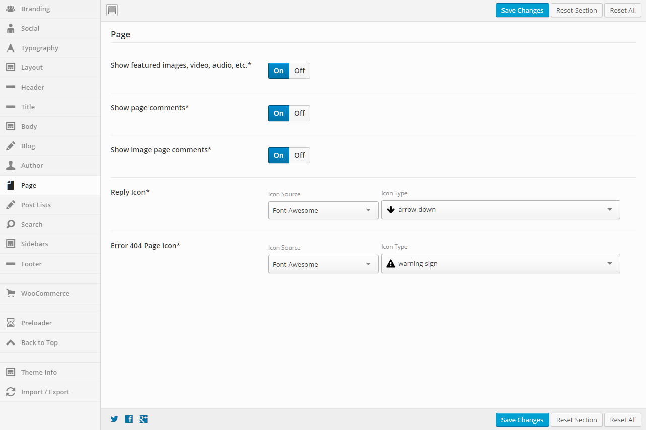
The Post Options metabox controls a number of aspects on your page/post. You can control the layout, header, title, footer, sidebars, background, and any post/page specific code.

Header

Header Display Mode
Static - stays at the top of the page and not the viewport. When scrolled, the header may be scrolled out of view.
Fixed - keeps the header fixed to the top of the screen. When scrolled, the header will not move but will remain visible.
Show/Hide - hides the header when scrolling down. Show the header when the user scrolls up.
Shrink - shrinks the header and keeps it visible on the screen as the user scrolls.
Custom - like the show/hide option but you set your own custom CSS classes to apply instead of hiding and showing.
Header Template
Select the template that you want this page to use for the header. If you chose "Use Default", the default template will be used. This "Default Template" can be set in the Intensity theme options.
Secondary Header Template
Select the template that you want this page to use for the secondary header. If you chose "Use Default", the default template will be used. This "Default Template" can be set in the Intensity theme options.
Header Menu
Select the menu that you want this page to use. If you chose "Use Default", the default menu will be used. This "Default" menu can be set in the Intensity theme options.
Secondary Header Menu
Select the secondary header menu that you want this page to use. If you chose "Use Default", the default menu will be used. This "Default" menu can be set in the Intensity theme options.
Header Sidebar 1
Set the Sidebar to be used.
Header Sidebar 2
Set the Sidebar to be used.
Header Sidebar 3
Set the Sidebar to be used.
Header Sidebar 4
Set the Sidebar to be used.
Secondary Header Sidebar 1
Set the Sidebar to be used.
Secondary Header Sidebar 2
Set the Sidebar to be used.
Secondary Header Sidebar 3
Set the Sidebar to be used.
Secondary Header Sidebar 4
Set the Sidebar to be used.

Title

Show Main Title
Select whether you want the main title to show or not. This is the "Title" section, found just below the menu. If you chose "Use Default", this option is set in the Intensity theme options.
Title Template
Select the template that you want this page to use for the title. If you chose "Use Default", the default template will be used. This "Default Template" can be set in the Intensity theme options. The "title" will only be shown if the "Show Main Title" option on the Layout tab is set to "Show" or the default is to show the title.
Title Text
Set the text to be shown in the Title, the default will be to show the page/post title.
Title Sidebar 1
Set the Sidebar to be used.
Title Sidebar 2
Set the Sidebar to be used.
Title Sidebar 3
Set the Sidebar to be used.
Title Sidebar 4
Set the Sidebar to be used.

Body

Content Position
Select whether you want the content of your page to be behind the menu or below the menu. Your options are "Top, behind menu" or "Below menu".
Padding Top
Set this option to add a top padding (measured in pixels) to the main content area.
Padding Bottom
Set this option to add a bottom padding (measured in pixels) to the main content area.

Footer

Footer Template
Select the template that you want this page to use for the footer. If you chose "Use Default", the default template will be used. This "Default Template" can be set in the Intensity theme options.
Show Primary Footer
Select whether you want the primary footer to be shown on the page or not. Your options are "Use Default", "Show", or "Hide".
Show Secondary Footer
Select whether you want the secondary footer to be shown on the page or not. Your options are "Use Default", "Show", or "Hide".
Footer Menu
Select the footer menu that you want this page to use. If you chose "Use Default", the default menu will be used. This "Default" menu can be set in the Intensity theme options.
Footer Sidebar 1
Set the Sidebar to be used.
Footer Sidebar 2
Set the Sidebar to be used.
Footer Sidebar 3
Set the Sidebar to be used.
Footer Sidebar 4
Set the Sidebar to be used.
Secondary Footer Sidebar 1
Set the Sidebar to be used.
Secondary Footer Sidebar 2
Set the Sidebar to be used.
Secondary Footer Sidebar 3
Set the Sidebar to be used.
Secondary Footer Sidebar 4
Set the Sidebar to be used.

Sidebars

Layout
Select the layout for the sidebars that you want the page to use. Your options are "Use Default", "1 Column", "2 Column Left", "2 Column Right", "3 Column Middle", "3 Column Left", "3 Column Right".
Left
Set the sidebar that you want on the left.
Right
Set the sidebar that you want on the right.
Before Content
Set the sidebar that you want to show before the content.
After Content
Set the sidebar that you want to show after the content.

Background

Color
Select the color that you want to be used for the background of the page.
Image
If you want an image as the background of the page, select the image.
Image Mode
If you selected an image as the background, set the image mode for that image here. Your choices are "Full Screen", "Repeat", "Repeat Horizontally", "Repeat Vertically", or "No Repeat".

Comments

Show Comments
Select whether you want the page/post comments to show or not.
Template
Select the template that you want this page to use for the comments.

Extras

Show Preloader
Select whether you want the preloader to show or not during page load. If you chose "Use Default", this option is set in the Intensity theme options.
CSS Code
If you have page specific CSS, it can be placed here. You do not need to include style tags.
Closing </head> Code
Custom code to add before the closing </head> tag. It will be added as-is and should include any necessary script or html tags.
Closing </body> Code
Custom code to add before the closing </body> tag. It will be added as-is and should include any necessary script or html tags.

Featured Media Metabox

The Featured Media metabox allows you to set the featured media to be shown on the page and also how the media is shown.

Gallery

Featured Gallery
Click the "Add to gallery" button to view the media popup. Select the images that you want to be shown in the gallery. Hit the "Select" button once you have the image(s) selected. If you want to remove an image, hover over the image and click the "X".

Gallery Image Options

Image Type
Select the template that you want this page to use for the header. If you chose "Use Default", the default template will be used. This "Default Template" can be set in the Intensity theme options.
Shadow
Select the template that you want this page to use for the title. If you chose "Use Default", the default template will be used. This "Default Template" can be set in the Intensity theme options. The "title" will only be shown if the "Show Main Title" option on the Layout tab is set to "Show" or the default is to show the title.
Hover Effect Type
Select the template that you want this page to use for the footer. If you chose "Use Default", the default template will be used. This "Default Template" can be set in the Intensity theme options.
Subtle Hover Effect
Select whether you want the primary footer to be shown on the page or not. Your options are "Use Default", "Show", or "Hide".
Effeckt Hover Effect
Select whether you want the primary footer to be shown on the page or not. Your options are "Use Default", "Show", or "Hide".
Caman Effect

*Only visible for Image Type of "Caman".

Start Effect

*Only visible for Image Type of "Adipoli".

Hover Effect

*Only visible for Image Type of "Adipoli".

Splits

*Only visible for Image Type of "Picstrip".

Horizontal Gutter

*Only visible for Image Type of "Picstrip".

Vertical Gutter

*Only visible for Image Type of "Picstrip".

Audio

Audio URL
Enter the URL to the audio file.

Video

Type
Select the type of video. Your options are "WordPress", "Blip.tv", "College Humor", "Flickr", "FunnyOrDie.com", "Hulu", "Qik", "Revision3", "Screenr", "Ted", "Viddler", "Vimeo", "WordPress.tv", or "Youtube".
Video Size
Set the size of the video. Your options are "Auto", "Wide (16:9)", "Standard (4:3)", or "Square (1:1)".
Poster Image
Select an image to be used as the Poster Image. This image will displayed prior to the video starting.
MP4 Video
Select an MP4 video from your media library.
*Only visible for Type of "WordPress".
OGV Video
Select an OGV video from your media library.
*Only visible for Type of "WordPress".
WebM Video
Select an WebM video from your media library.
*Only visible for Type of "WordPress".
Video URL
Set the URL to the video.
*Visible for all Types aside from "WordPress".

Color

Color
Set the color that you want to be used in place of media.

Social

This section defines social media links and settings. Enter a link that you want to use for the social network icon. If left blank, no icon will be shown.

General

Display Order
Reorder the items however you want by clicking on the “direction arrow” and dragging the item to the location that you want it. These social items are found in the header and footer.
Default Header Color
This option will set the default color of all the social icons in the header. If no colors are set for specific social icons, this color will be used.
Default Header Background Color
This option will set the default background color of all the social icons in the header. If no background colors are set for specific social icons, this color will be used.
Default Footer Color
This option will set the default color of all the social icons in the footer. If no colors are set for specific social icons, this color will be used.
Default Footer Background Color
This option will set the default background color of all the social icons in the footer. If no background colors are set for specific social icons, this color will be used.
Border Radius
This option sets the border radius to be used around each social icon in the header and footer.Leave blank if you do not want a border radius applied.
Social Links Target
Controls how the social links will open when clicked
Social Links Rel
See rel for more information.

The Social and Custom Icon Options shown below apply to all of the following sections found on the Social tab.

  • Email
  • Facebook
  • Google+
  • Instagram
  • LinkedIn
  • Pinterest
  • RSS
  • Twitter
  • YouTube
  • Custom 1
  • Custom 2
  • Custom 3

Social and Custom Icon Options

Link
Put the link to the social site that you are wanting to link to. If you are using the Email link, use mailto (mailto:someone@example.com). An example of a mailto link can be found in the examples here.
Icon
Set the icon that you want to be used. You can select from a number of icon sources. The default is to use the Font Awesome icons.
Header Color
This option will set the color of the social icon in the header. If no color is set, the default color will be used.
Header Background Color
This option will set the background color of the social icon in the header. If no background color is set, the default background color will be used.
Footer Color
This option will set the color of the social icon in the footer. If no color is set, the default color will be used.
Footer Background Color
This option will set the background color of the social icon in the footer. If no background color is set, the default background color will be used.

Typography

This section gives you the ability to control all aspects of the typography on your website.

General

Body
Font Family – Set the font family for the text
Backup Font Family – Use this font if the main Font Family cannot be found
Font Weight & Style – Set the font weight (bold, normal, etc…)
Font Size – Set the font size for the text
Line Height – Set the font line height for the text
Font Color – Set the font color for the text

Header Tags

H1 – H6
Font Family – Set the font family for the text
Backup Font Family – Use this font if the main Font Family cannot be found
Font Weight & Style – Set the font weight (bold, normal, etc…)
Text Align – Set this option to align the text
Text Transform – Set this option to transform the text (uppercase, lowercase, etc…)
Font Size – Set the font size for the text
Line Height – Set the font line height for the text
Font Color – Set the font color for the text

Links

Link, Link Hover
Font Family – Set the font family for the text
Font Weight & Style – Set the font weight (bold, normal, etc…)
Text Decoration – Set this to add decorations to links (underline, line-through, etc…)
Font Size – Set the font size for the text
Line Height – Set the font line height for the text
Font Color – Set the font color for the text

Posts, Pages, and Other Content

Blog Metadata
Font Family – Set the font family for the text
Backup Font Family – Use this font if the main Font Family cannot be found
Font Weight & Style – Set the font weight (bold, normal, etc…)
Font Size – Set the font size for the text
Line Height – Set the font line height for the text
Font Color – Set the font color for the text
Pagination
Font Family – Set the font family for the text
Font Weight & Style – Set the font weight (bold, normal, etc…)
Font Size – Set the font size for the text
Line Height – Set the font line height for the text
Font Color – Set the font color for the text

Header

Header Menu Top Level
Font Family – Set the font family for the text
Font Weight & Style – Set the font weight (bold, normal, etc…)
Font Size – Set the font size for the text
Line Height – Set the font line height for the text
Font Color – Set the font color for the text
Header Menu Secondary Level
Font Family – Set the font family for the text
Font Weight & Style – Set the font weight (bold, normal, etc…)
Font Size – Set the font size for the text
Line Height – Set the font line height for the text
Font Color – Set the font color for the text
Secondary Header
Font Family – Set the font family for the text
Font Weight & Style – Set the font weight (bold, normal, etc…)
Font Size – Set the font size for the text
Line Height – Set the font line height for the text
Font Color – Set the font color for the text
Secondary Header Menu Top Level
Font Family – Set the font family for the text
Font Weight & Style – Set the font weight (bold, normal, etc…)
Font Size – Set the font size for the text
Line Height – Set the font line height for the text
Font Color – Set the font color for the text
Title
Font Family – Set the font family for the text
Backup Font Family – Use this font if the main Font Family cannot be found
Font Weight & Style – Set the font weight (bold, normal, etc…)
Text Align – Set this option to align the text
Text Transform – Set this option to transform the text (uppercase, lowercase, etc…)
Font Size – Set the font size for the text
Line Height – Set the font line height for the text
Font Color – Set the font color for the text
Tagline
Font Family – Set the font family for the text
Font Weight & Style – Set the font weight (bold, normal, etc…)
Font Size – Set the font size for the text
Line Height – Set the font line height for the text
Font Color – Set the font color for the text

Title

Title
Font Family – Set the font family for the text
Backup Font Family – Use this font if the main Font Family cannot be found
Font Weight & Style – Set the font weight (bold, normal, etc…)
Font Size – Set the font size for the text
Line Height – Set the font line height for the text
Font Color – Set the font color for the text
Breadcrumb
Font Family – Set the font family for the text
Font Weight & Style – Set the font weight (bold, normal, etc…)
Font Size – Set the font size for the text
Line Height – Set the font line height for the text
Font Color – Set the font color for the text

Sidebar

Widget Heading
Font Family – Set the font family for the text
Font Weight & Style – Set the font weight (bold, normal, etc…)
Text Align – Set this option to align the text
Font Size – Set the font size for the text
Line Height – Set the font line height for the text
Font Color – Set the font color for the text

Footer

Footer
Font Family – Set the font family for the text
Font Weight & Style – Set the font weight (bold, normal, etc…)
Font Size – Set the font size for the text
Line Height – Set the font line height for the text
Font Color – Set the font color for the text
Footer Menu
Font Family – Set the font family for the text
Font Weight & Style – Set the font weight (bold, normal, etc…)
Font Size – Set the font size for the text
Line Height – Set the font line height for the text
Font Color – Set the font color for the text
Secondary Footer
Font Family – Set the font family for the text
Font Weight & Style – Set the font weight (bold, normal, etc…)
Font Size – Set the font size for the text
Line Height – Set the font line height for the text
Font Color – Set the font color for the text
Secondary Footer Menu
Font Family – Set the font family for the text
Font Weight & Style – Set the font weight (bold, normal, etc…)
Font Size – Set the font size for the text
Line Height – Set the font line height for the text
Font Color – Set the font color for the text
Widget Heading
Font Family – Set the font family for the text
Font Weight & Style – Set the font weight (bold, normal, etc…)
Text Align – Set this option to align the text
Font Size – Set the font size for the text
Line Height – Set the font line height for the text
Font Color – Set the font color for the text

Custom Font 1 & Custom Font 2

OpenType (.otf)
Upload your own OpenType font. These fonts have a .otf file extension.
Embedded OpenType (.eot)
Upload your own Embedded OpenType font. These fonts have a .eot file extension.
TrueType (.ttf)
Upload your own TrueType font. These fonts have a .ttf file extension.
Web Open Font Format (.woff)
Upload your own Web Open Font Format font. These fonts have a .woff file extension.
Web Open Font Format 2.0 (.woff2)
Upload your own Web Open Font Format 2.0 font. These fonts have a .woff2 file extension.
Scalable Vector Graphics (.svg)
Upload your own Scalable Vector Graphics font. These fonts have a .svg file extension.

Layout

This section gives you the ability to control the layout of your website, including responsive breakpoints, content widths, margins, paddings, and sidebar widths.

General

Layout Mode
Full or boxed width for body content
Full width allows the content to extend the entire browser width. With full width, content sections can be used to box the content. If you want the content to always be boxed, then choose boxed.
Margin
Top – Set this option to add a top margin (measured in pixels)
Bottom – Set this option to add a bottom margin (measured in pixels)

Left/Right Header Width

Width (px)
The width of the left/right header (default is 300px)
Responsive Breakpoint (px)
The responsive breakpoint used to switch to the mobile header. Should be set to about 800-900px more than the header width (default is 1025px)

Content Width

Extra Small Devices (px or %)
The width of the content container when viewed on extra small devices (less than 768px wide)
Small Devices (px or %)
The width of the content container when viewed on small devices (768px to 991px wide)
Medium Devices (px or %)
The width of the content container when viewed on medium devices (992px to 1199px wide)
Large Devices (px or %)
The width of the content container when viewed on large devices (greater than 1199px wide)

Intensity uses a 12 column grid system. Below you can pick how many columns to use for the sidebars when they are enabled. The size of the content area will be calculated based on the number of columns left over. If there are zero or less columns left over, the content will be a full 12 columns wide.

For example, if the left and right sidebars are enabled and set to size 3, then the content will be “total number of columns” – “left sidebar columns” – “right sidebar columns” or 12 – 3 – 3 = 6 columns wide.

The following options are the same for both the right and left sidebars, so the options are only being listed once, but you can control both sidebars in Intensity.

Left/Right Sidebar

Extra Small Devices
Pick the number of columns to use when viewing the site on extra small devices.
Small Devices
Pick the number of columns to use when viewing the site on small devices.
Medium Devices
Pick the number of columns to use when viewing the site on medium devices.
Large Devices
Pick the number of columns to use when viewing the site on large devices.
Padding
Top – Set this option to add a top margin (measured in pixels)
Right- Set this option to add a right margin (measured in pixels)
Bottom – Set this option to add a bottom margin (measured in pixels)
Left – Set this option to add a left margin (measured in pixels)

Header

This section gives you the ability to control nearly all things related to the header. You can choose the layout of the header, the template that is being used, and all sorts of color and border options.

General

Display Mode
Static – stays at the top of the page and not the viewport. When scrolled, the header may be scrolled out of view.
Fixed – keeps the header fixed to the top of the screen. When scrolled, the header will not move but will remain visible.
Show/Hide – hides the header when scrolling down. Show the header when the user scrolls up.
Shrink – shrinks the header and keeps it visible on the screen as the user scrolls.
Custom – like the show/hide option but you set your own custom CSS classes to apply instead of hiding and showing.
Show Animation
Set a “show” animation for the header. This animation will take place when the header is loaded.
Hide Animation
Set a “hide” animation for the header. This animation will take place when the header is hidden during scrolling. This applies to the “Show/Hide” display mode only.
Sections
Check each of the sections that you want to show in the header. Not all the sections may apply to all the header templates.
Columns
Set the number of columns you want the header to be. This may not apply to all the header templates.
Opacity
Set the opacity for the header. Default is 100 (0 is completely transparent, 100 is solid).
Scroll Opacity
Set this option to control the opacity of the header when visible and scrolling. This applies to the “Fixed” and “Shrink” display modes only.
Default is 95 (0 is completely transparent, 100 is solid).
Over Content Opacity
Set this option to control the opacity when the menu is set to be on top of the content.
Default is 80 (0 is completely transparent, 100 is solid).
Shadow
Set this option to add a shadow beneath the header. There are a number of shadows to choose from. The default is no shadow.

Primary Header – General

Template
This option allows you to select a template for the header. There are a number of templates included with Intensity, but you can also create your own. See Creating Content > Templates for more information.

Primary Header – Style

Background
This option allows the control of the header background. You can set the color, transparency, repeat, size, attachment, position, and image for the background of the header. More information on these settings can be found here.

Primary Header – Layout

Full or Boxed
Full or boxed width for header content
Full width allows the content to extend the entire browser width. With full width, content sections can be used to box the content. If you want the content to always be boxed, then choose boxed.
Padding
Top – Set this option to add a top padding (measured in pixels)
Right- Set this option to add a right padding (measured in pixels)
Bottom – Set this option to add a bottom padding (measured in pixels)
Left – Set this option to add a left padding (measured in pixels)
Logo Margin
Top – Set this option to add a top margin (measured in pixels)
Right- Set this option to add a right margin (measured in pixels)
Bottom – Set this option to add a bottom margin (measured in pixels)
Left – Set this option to add a left margin (measured in pixels)
Navigation Margin
Top – Set this option to add a top margin (measured in pixels)
Right- Set this option to add a right margin (measured in pixels)
Bottom – Set this option to add a bottom margin (measured in pixels)
Left – Set this option to add a left margin (measured in pixels)

Primary Header – Border

Top
Set the different values for the border: the height in pixels, the type of border (solid, dotted, etc…), and the color
Bottom
Set the different values for the border: the height in pixels, the type of border (solid, dotted, etc…), and the color
Divider
Set the different values for the border: the height in pixels, the type of border (solid, dotted, etc…), and the color
A few of the header templates contain a divider to separate menus or other areas. This setting applies to that divider

Primary Header – Menu

Mobile Responsive
This option controls the mobile responsiveness of the menu. Turn this option on if you want the menu to be mobile responsive and off if you do not.
Icon Before
Set the icon if you want an icon to show in the menu, before each menu item.
Select an Icon Source, then the Icon Type will be populated.
Icon Before Parents Only
Set this option if you want the icon that is set for “Icon Before” above to only be shown for parent menu items.
Icon After
Set the icon if you want an icon to show in the menu, after each menu item.
Select an Icon Source, then the Icon Type will be populated.
Icon After Parents Only
Set this option if you want the icon that is set for “Icon After” above to only be shown for parent menu items.

Primary Header – Top Level

Padding
Top – Set this option to add a top padding (measured in pixels)
Right- Set this option to add a right padding (measured in pixels)
Bottom – Set this option to add a bottom padding (measured in pixels)
Left – Set this option to add a left padding (measured in pixels)
Margin
Top – Set this option to add a top margin (measured in pixels)
Right- Set this option to add a right margin (measured in pixels)
Bottom – Set this option to add a bottom margin (measured in pixels)
Left – Set this option to add a left margin (measured in pixels)
Hover Font Color
Set the hover font color for when you hover over a top level menu item.
Hover Background Color
Set the hover background color for when you hover over a top level menu item.
Active Font Color
Set the active font color for the active menu item.
Active Background Color
Set the active background color for the active menu item.
Active Hover Font Color
Set the active hover font color for when you hover over the active menu item.
Active Hover Background Color
Set the active hover background color for when you hover over the active menu item.
Border
Set a border on top, right, bottom, or left along with style (dotted, dashed, etc…) and color for the top level menu.
Hover Border
Set a border on top, right, bottom, or left along with style (dotted, dashed, etc…) and color for when you hover over the top level menu.

Primary Header – Secondary Level

Hover Font Color
Set the hover font color for when you hover over a secondary level menu item.
Hover Background Color
Set the hover background color for when you hover over a secondary level menu item.

Secondary Header – General

Template
This option allows you to select a template for the secondary header. There are a number of templates included with Intensity, but you can also create your own. See Creating Content > Templates for more information.

Secondary Header – Style

Background
This option allows the control of the secondary header background. You can set the color, transparency, repeat, size, attachment, position, and image for the background of the secondary header. More information on these settings can be found here.

Secondary Header – Layout

Full or Boxed
Full or boxed width for header content
Full width allows the content to extend the entire browser width. With full width, content sections can be used to box the content. If you want the content to always be boxed, then choose boxed.
Padding
Top – Set this option to add a top padding (measured in pixels)
Right- Set this option to add a right padding (measured in pixels)
Bottom – Set this option to add a bottom padding (measured in pixels)
Left – Set this option to add a left padding (measured in pixels)

Secondary Header – Border

Top
Set the different values for the border: the height in pixels, the type of border (solid, dotted, etc…), and the color
Bottom
Set the different values for the border: the height in pixels, the type of border (solid, dotted, etc…), and the color