Hover over Pages in the admin sidebar and click the Add New option or navigate to Pages in your admin sidebar and click the Add New option.
Input a new name for your page, then find the Page Attributes box on right side.
Set your Parent page. It’s usually set to No Parent.
Set your page template from the Template dropdown list. See list of page templates below.
Content for your page goes in the editing field, use the Visual or Text editor. Page content is mainly built using Shortcodes. See the Shortcodes section for how to use them.
Page Sections
Shortcodes – Access the Shortcodes dialog to insert shortcodes. Snippets – Access the Snippets dialog to insert snippets. Page Attributes – Set your Parent page and Template. The Parent is usually set to “(no parent)” and the template is normally set to “Default Template”. Post Options – This section allows you to control much of the layout of your page. Set portions of your page pertaining to layout, header, footer, title bar, sidebars, background, and post/page specific code. Featured Media – Add a gallery to your page and set the options or add audio or video for the featured item as well. These settings are typically used on Posts, but can also be used on Pages.
Post Options Metabox
The Post Options metabox controls a number of aspects on your page/post. You can control the layout, header, title, footer, sidebars, background, and any post/page specific code.
Header
Header Display Mode
Static - stays at the top of the page and not the viewport. When scrolled, the header may be scrolled out of view.
Fixed - keeps the header fixed to the top of the screen. When scrolled, the header will not move but will remain visible.
Show/Hide - hides the header when scrolling down. Show the header when the user scrolls up.
Shrink - shrinks the header and keeps it visible on the screen as the user scrolls.
Custom - like the show/hide option but you set your own custom CSS classes to apply instead of hiding and showing.
Header Template
Select the template that you want this page to use for the header. If you chose "Use Default", the default template will be used. This "Default Template" can be set in the Intensity theme options.
Secondary Header Template
Select the template that you want this page to use for the secondary header. If you chose "Use Default", the default template will be used. This "Default Template" can be set in the Intensity theme options.
Header Menu
Select the menu that you want this page to use. If you chose "Use Default", the default menu will be used. This "Default" menu can be set in the Intensity theme options.
Secondary Header Menu
Select the secondary header menu that you want this page to use. If you chose "Use Default", the default menu will be used. This "Default" menu can be set in the Intensity theme options.
Header Sidebar 1
Set the Sidebar to be used.
Header Sidebar 2
Set the Sidebar to be used.
Header Sidebar 3
Set the Sidebar to be used.
Header Sidebar 4
Set the Sidebar to be used.
Secondary Header Sidebar 1
Set the Sidebar to be used.
Secondary Header Sidebar 2
Set the Sidebar to be used.
Secondary Header Sidebar 3
Set the Sidebar to be used.
Secondary Header Sidebar 4
Set the Sidebar to be used.
Title
Show Main Title
Select whether you want the main title to show or not. This is the "Title" section, found just below the menu. If you chose "Use Default", this option is set in the Intensity theme options.
Title Template
Select the template that you want this page to use for the title. If you chose "Use Default", the default template will be used. This "Default Template" can be set in the Intensity theme options. The "title" will only be shown if the "Show Main Title" option on the Layout tab is set to "Show" or the default is to show the title.
Title Text
Set the text to be shown in the Title, the default will be to show the page/post title.
Title Sidebar 1
Set the Sidebar to be used.
Title Sidebar 2
Set the Sidebar to be used.
Title Sidebar 3
Set the Sidebar to be used.
Title Sidebar 4
Set the Sidebar to be used.
Body
Content Position
Select whether you want the content of your page to be behind the menu or below the menu. Your options are "Top, behind menu" or "Below menu".
Padding Top
Set this option to add a top padding (measured in pixels) to the main content area.
Padding Bottom
Set this option to add a bottom padding (measured in pixels) to the main content area.
Footer
Footer Template
Select the template that you want this page to use for the footer. If you chose "Use Default", the default template will be used. This "Default Template" can be set in the Intensity theme options.
Show Primary Footer
Select whether you want the primary footer to be shown on the page or not. Your options are "Use Default", "Show", or "Hide".
Show Secondary Footer
Select whether you want the secondary footer to be shown on the page or not. Your options are "Use Default", "Show", or "Hide".
Footer Menu
Select the footer menu that you want this page to use. If you chose "Use Default", the default menu will be used. This "Default" menu can be set in the Intensity theme options.
Footer Sidebar 1
Set the Sidebar to be used.
Footer Sidebar 2
Set the Sidebar to be used.
Footer Sidebar 3
Set the Sidebar to be used.
Footer Sidebar 4
Set the Sidebar to be used.
Secondary Footer Sidebar 1
Set the Sidebar to be used.
Secondary Footer Sidebar 2
Set the Sidebar to be used.
Secondary Footer Sidebar 3
Set the Sidebar to be used.
Secondary Footer Sidebar 4
Set the Sidebar to be used.
Sidebars
Layout
Select the layout for the sidebars that you want the page to use. Your options are "Use Default", "1 Column", "2 Column Left", "2 Column Right", "3 Column Middle", "3 Column Left", "3 Column Right".
Left
Set the sidebar that you want on the left.
Right
Set the sidebar that you want on the right.
Before Content
Set the sidebar that you want to show before the content.
After Content
Set the sidebar that you want to show after the content.
Background
Color
Select the color that you want to be used for the background of the page.
Image
If you want an image as the background of the page, select the image.
Image Mode
If you selected an image as the background, set the image mode for that image here. Your choices are "Full Screen", "Repeat", "Repeat Horizontally", "Repeat Vertically", or "No Repeat".
Comments
Show Comments
Select whether you want the page/post comments to show or not.
Template
Select the template that you want this page to use for the comments.
Extras
Show Preloader
Select whether you want the preloader to show or not during page load. If you chose "Use Default", this option is set in the Intensity theme options.
CSS Code
If you have page specific CSS, it can be placed here. You do not need to include style tags.
Closing </head> Code
Custom code to add before the closing </head> tag. It will be added as-is and should include any necessary script or html tags.
Closing </body> Code
Custom code to add before the closing </body> tag. It will be added as-is and should include any necessary script or html tags.
Featured Media Metabox
The Featured Media metabox allows you to set the featured media to be shown on the page and also how the media is shown.
Gallery
Featured Gallery
Click the "Add to gallery" button to view the media popup. Select the images that you want to be shown in the gallery. Hit the "Select" button once you have the image(s) selected. If you want to remove an image, hover over the image and click the "X".
Gallery Image Options
Image Type
Select the template that you want this page to use for the header. If you chose "Use Default", the default template will be used. This "Default Template" can be set in the Intensity theme options.
Shadow
Select the template that you want this page to use for the title. If you chose "Use Default", the default template will be used. This "Default Template" can be set in the Intensity theme options. The "title" will only be shown if the "Show Main Title" option on the Layout tab is set to "Show" or the default is to show the title.
Hover Effect Type
Select the template that you want this page to use for the footer. If you chose "Use Default", the default template will be used. This "Default Template" can be set in the Intensity theme options.
Subtle Hover Effect
Select whether you want the primary footer to be shown on the page or not. Your options are "Use Default", "Show", or "Hide".
Effeckt Hover Effect
Select whether you want the primary footer to be shown on the page or not. Your options are "Use Default", "Show", or "Hide".
Caman Effect
*Only visible for Image Type of "Caman".
Start Effect
*Only visible for Image Type of "Adipoli".
Hover Effect
*Only visible for Image Type of "Adipoli".
Splits
*Only visible for Image Type of "Picstrip".
Horizontal Gutter
*Only visible for Image Type of "Picstrip".
Vertical Gutter
*Only visible for Image Type of "Picstrip".
Audio
Audio URL
Enter the URL to the audio file.
Video
Type
Select the type of video. Your options are "WordPress", "Blip.tv", "College Humor", "Flickr", "FunnyOrDie.com", "Hulu", "Qik", "Revision3", "Screenr", "Ted", "Viddler", "Vimeo", "WordPress.tv", or "Youtube".
Video Size
Set the size of the video. Your options are "Auto", "Wide (16:9)", "Standard (4:3)", or "Square (1:1)".
Poster Image
Select an image to be used as the Poster Image. This image will displayed prior to the video starting.
MP4 Video
Select an MP4 video from your media library.
*Only visible for Type of "WordPress".
OGV Video
Select an OGV video from your media library.
*Only visible for Type of "WordPress".
WebM Video
Select an WebM video from your media library.
*Only visible for Type of "WordPress".
Video URL
Set the URL to the video.
*Visible for all Types aside from "WordPress".
Color
Color
Set the color that you want to be used in place of media.
This section gives you the ability to control what information is shown about the author on the archive page.
Archive Page
Show Bio
Set this option to “On” if you want the author bio to show, and “Off” if you do not want it to show.
Bio Template
This option allows you to select a template for the author’s bio. There are a number of templates included with Intensity, but you can also create your own. See Creating Content > Templates for more information.
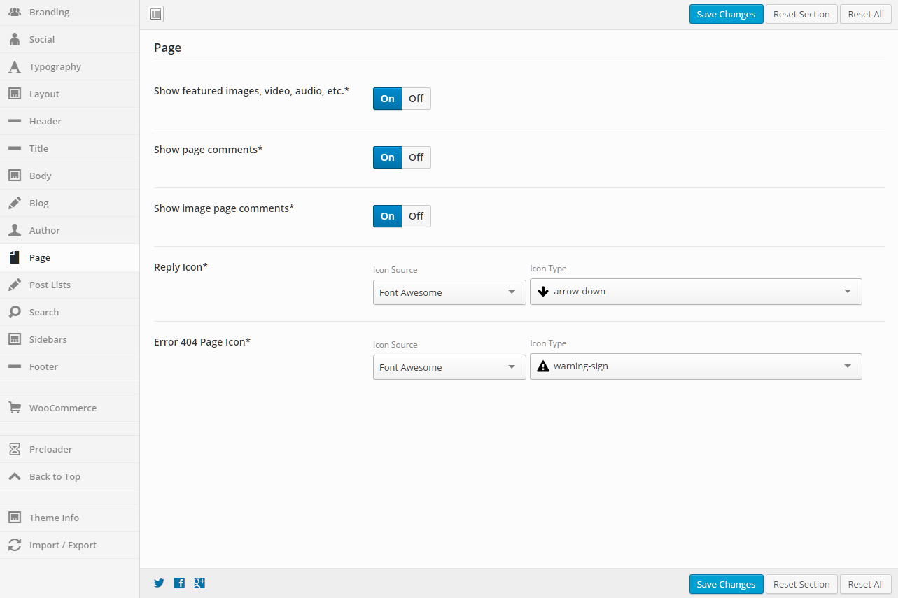
This section gives you the ability to control page options.
General
Show Featured Images, Video, Audio, etc.
Set this option to “On” if you want the featured items to show, and “Off” if you do not want them to show.
Show Page Comments
Set this option to “On” if you want the page comments to show, and “Off” if you do not want them to show.
Show Image Page Comments
Set this option to “On” if you want the image page comments to show, and “Off” if you do not want them to show.
Reply Icon
Set the icon that you want to be used. You can select from a number of icon sources. Select an Icon Source, then the Icon Type will be populated. The default is to use the Font Awesome “arrow-down” icon.
Error 404 Page Icon
Set the icon that you want to be used. You can select from a number of icon sources. Select an Icon Source, then the Icon Type will be populated. The default is to use the Font Awesome “warning-sign” icon.
This section gives you the ability to control how post lists are shown for all the various post types and their archive pages as well.
General
Post List Location
Change to control the settings per location. When done, make sure to save the changes. The settings below this dropdown will apply to the post list location that is chosen.
List
Template
This option allows you to select a template for the meta data. There are a number of templates included with Intensity, but you can also create your own. See Creating Content > Templates for more information.
Posts Per Page
Set the number of posts to show per page.
Template Content
Select what type of content you want to be shown in the template. If you choose “Excerpt” or “Content”, you can set the “Excerpt/Content Length” to limit how much is shown. If you choose “Full Post Content”, the entire post will be shown.
Excerpt/Content Length
Set the number of words to be shown in the template.
Order By
Select what you would like to order the list by (typical setting would be “Post ID”)
Order
Select how you would like to order the post list (typical setting would be “Descending”)
Masonry
Set this to “On” if you want a Masonry layout, “Off” if you do not want a Masonry layout, or “Default” if you want to use the setting stored for this option in the “Default Settings” (this is the option “Default Settings” in the “Post List Location” dropdown).
In finite Scroll
Set this to “On” if you want Infinite Scroll, “Off” if you do not want Infinite Scroll, or “Default” if you want to use the setting stored for this option in the “Default Settings” (this is the option “Default Settings” in the “Post List Location” dropdown).
Social Sharing Buttons
Set this to “On” if you want to show the social sharing buttons, “Off” if you do not want to show the social sharing buttons, or “Default” if you want to use the setting stored for this option in the “Default Settings” (this is the option “Default Settings” in the “Post List Location” dropdown).
Filter
Set this to “On” if you want to show the filter, “Off” if you do not want to show the filter, or “Default” if you want to use the setting stored for this option in the “Default Settings” (this is the option “Default Settings” in the “Post List Location” dropdown).
Author Image
Set this to “On” if you want to show the author image, “Off” if you do not want to show the author image, or “Default” if you want to use the setting stored for this option in the “Default Settings” (this is the option “Default Settings” in the “Post List Location” dropdown).
Read More
Set this to “On” if you want to show the Read More button/link, “Off” if you do not want to show the Read More button/link, or “Default” if you want to use the setting stored for this option in the “Default Settings” (this is the option “Default Settings” in the “Post List Location” dropdown).
Meta Data
Meta Data
Set this to “On” if you want to show the meta data, “Off” if you do not want to show the meta data, or “Default” if you want to use the setting stored for this option in the “Default Settings” (this is the option “Default Settings” in the “Post List Location” dropdown).
Template
This option allows you to select a template for the meta data. There are a number of templates included with Intensity, but you can also create your own. See Creating Content > Templates for more information.
Date
Set this to “On” if you want to show the date, “Off” if you do not want to show the date, or “Default” if you want to use the setting stored for this option in the “Default Settings” (this is the option “Default Settings” in the “Post List Location” dropdown).
Author
Set this to “On” if you want to show the author, “Off” if you do not want to show the author, or “Default” if you want to use the setting stored for this option in the “Default Settings” (this is the option “Default Settings” in the “Post List Location” dropdown).
Categories
Set this to “On” if you want to show the categories, “Off” if you do not want to show the categories, or “Default” if you want to use the setting stored for this option in the “Default Settings” (this is the option “Default Settings” in the “Post List Location” dropdown).
Tags
Set this to “On” if you want to show the tags, “Off” if you do not want to show the tags, or “Default” if you want to use the setting stored for this option in the “Default Settings” (this is the option “Default Settings” in the “Post List Location” dropdown).
Comments
Set this to “On” if you want to show the comments, “Off” if you do not want to show the comments, or “Default” if you want to use the setting stored for this option in the “Default Settings” (this is the option “Default Settings” in the “Post List Location” dropdown).
Animation
Type
Add an animation to the blog list.
Trigger
Select the trigger that will initiate the animation (scroll, hover, click, or delay).
Delay
Set this option if you want to delay the animation. The amount is in milliseconds.
Image
Images
Set this to “On” if you want to show images, “Off” if you do not want to show images, or “Default” if you want to use the setting stored for this option in the “Default Settings” (this is the option “Default Settings” in the “Post List Location” dropdown).
Show Missing Image
Set this to “On” if you want to show the missing image, “Off” if you do not want to show the missing image, or “Default” if you want to use the setting stored for this option in the “Default Settings” (this is the option “Default Settings” in the “Post List Location” dropdown).
Border Radius
Set a value for the border radius of the image (50% will make the image a circle if the image is square).
%, em, px – examples: 25% or 10em or 20px
This section gives you the ability to set the post types that will be returned in the search results and also the icon that will be used (default is a magnifying glass).
General
Search Results Post Types
The type of posts to show in the search results
Mark all of the post types that you want to show in the search results.
Icon
Set the icon to be used for the search. This icon is shown next to the menu in many of the Intensity header templates.
Select an Icon Source, then the Icon Type will be populated.
This section gives you the ability to control the sidebars for the post type and post type archive pages. The sidebar settings can be applied to all different post types and their archive pages.
General
Location
Change to control the settings per location. When done, make sure to save the changes. The settings below this dropdown will apply to the location that is chosen.
Content & Sidebar
Select the default main content and sidebar alignment. Choose between 1, 2 or 3 column layout.
Left Sidebar
Enter the sidebar name that will show on the left.
Right Sidebar
Enter the sidebar name that will show on the right.
Before Content Sidebar
Enter the sidebar name that will show before the content.
After Content Sidebar
Enter the sidebar name that will show after the content.
This section gives you the ability to control nearly all things related to the footer. You can choose the layout of the footer, the template that is being used, and color and border options.
General
Widget Heading Color
Set the widget heading color.
Primary Footer
Show
Turn this option On to show the primary footer and turn it Off to not show the primary footer. This value can be overridden at the page or post level.
Layout
Full or boxed width for footer content
Full width allows the content to extend the entire browser width. With full width, content sections can be used to box the content. If you want the content to always be boxed, then choose boxed.
Template
This option allows you to select a template for the footer. There are a number of templates included with Intensity, but you can also create your own. See Creating Content > Templates for more information.
Template Sections
Check each of the sections that you want to show in the footer. Not all the sections may apply to all the footer templates.
Padding
Top – Set this option to add a top padding (measured in pixels)
Right- Set this option to add a right padding (measured in pixels)
Bottom – Set this option to add a bottom padding (measured in pixels)
Left – Set this option to add a left padding (measured in pixels)
Columns
Set the number of columns you want the footer to be. This may not apply to all the footer templates.
Background
This option allows the control of the header background. You can set the color, transparency, repeat, size, attachment, position, and image for the background of the header. More information on these settings can be found here.
Top Border
Set the different values for the border: the height in pixels, the type of border (solid, dotted, etc…), and the color
Bottom Border
Set the different values for the border: the height in pixels, the type of border (solid, dotted, etc…), and the color
Opacity
Set the opacity for the footer. Default is 100 (0 is completely transparent, 100 is solid).
Secondary Footer
Show
Turn this option On to show the secondary footer and turn it Off to not show the secondary footer. This value can be overridden at the page or post level.
Template
This option allows you to select a template for the secondary footer. There are a number of templates included with Intensity, but you can also create your own. See Creating Content > Templates for more information.
Layout
Full or boxed width for footer content
Full width allows the content to extend the entire browser width. With full width, content sections can be used to box the content. If you want the content to always be boxed, then choose boxed.
Background
This option allows the control of the header background. You can set the color, transparency, repeat, size, attachment, position, and image for the background of the header. More information on these settings can be found here.
Top Border
Set the different values for the border: the height in pixels, the type of border (solid, dotted, etc…), and the color
Bottom Border
Set the different values for the border: the height in pixels, the type of border (solid, dotted, etc…), and the color
Padding
Top – Set this option to add a top padding (measured in pixels)
Right- Set this option to add a right padding (measured in pixels)
Bottom – Set this option to add a bottom padding (measured in pixels)
Left – Set this option to add a left padding (measured in pixels)
Opacity
Set the opacity for the secondary footer. Default is 100 (0 is completely transparent, 100 is solid).
This section gives you the ability to control the preloader. The preloader will display a preload effect while the page is being loaded. Often this is used to help make the loading transition smoother.
General
Show
Set this option to “On” if you want to show the preloader.
Type
Set this option if you want an effect to happen before the preloader and then after the preloader. This adds a transition effect as the content appears on the page.
Background Color
Set the background color of the page for the preloader
Image
Select an image that you want to show on the page as it is preloading.
HTML
Optional. Add custom HTML including necessary CSS and JS. This will be placed below the image if added.
This can be used to display a spinning icon or any HTML of your choice.
This section gives you the ability to control all aspects of the Back to Top button. This button will allow the user to click and return to the top of the page.
General
Show
Set this option to “On” if you want to show the Back To Top button.
Show on Mobile
Set this option to “On” if you want to show the Back To Top button on mobile devices .
Background Color
Set a background color for the button.
Icon Color
Set the icon color for the button.
Icon
Set the icon to be used for the Back to Top button.
Select an Icon Source, then the Icon Type will be populated.
Border Radius
Set a value for the border radius of the button (50% will make the button a circle).
%, em, px – examples: 25% or 10em or 20px
Show Animation
Set the animation that happens when the button is shown.
Hide Animation
Set the animation that happens when the button is hidden.
Scroll Height
Set the amount of pixels srolled before the button is shown.
Position
Top
Set the number of pixels from the top that you want to place the button.
%, em, px – examples: 25% or 10em or 20px
Bottom
Set the number of pixels from the bottom that you want to place the button.
%, em, px – examples: 25% or 10em or 20px
Left
Set the number of pixels from the left that you want to place the button.
%, em, px – examples: 25% or 10em or 20px
Right
Set the number of pixels from the right that you want to place the button.
%, em, px – examples: 25% or 10em or 20px