Branding

This section allows you to set your logo and other personal/company information to be used throughout your site. This information may display in the header, footer, widgets, or throughout the site.

Logo

Image
Upload the image that will be used as your logo.
Link
Add in a link so your logo directs to a page of your choice. Leaving blank will make the logo non-clickable. Use the complete url.
Animation In
Add an animation to your logo. This animation will happen once the logo loads (and after the animation delay). Leaving blank will make the logo non-animated.
Animation Delay
Add a delay to the logo animation (in milliseconds).

Site Information

Phone Number
Phone number to show in the header, footer, and throughout the site.
Email
Add in a link so your logo directs to a page of your choice. Leaving blank will make the logo non-Email to show in the header, footer, and throughout the site.
Address
Address to show in the header, footer, and throughout the site.
Copyright Text
The copyright text for your website, typically shown in the footer.

Back to Top

This section gives you the ability to control all aspects of the Back to Top button. This button will allow the user to click and return to the top of the page.
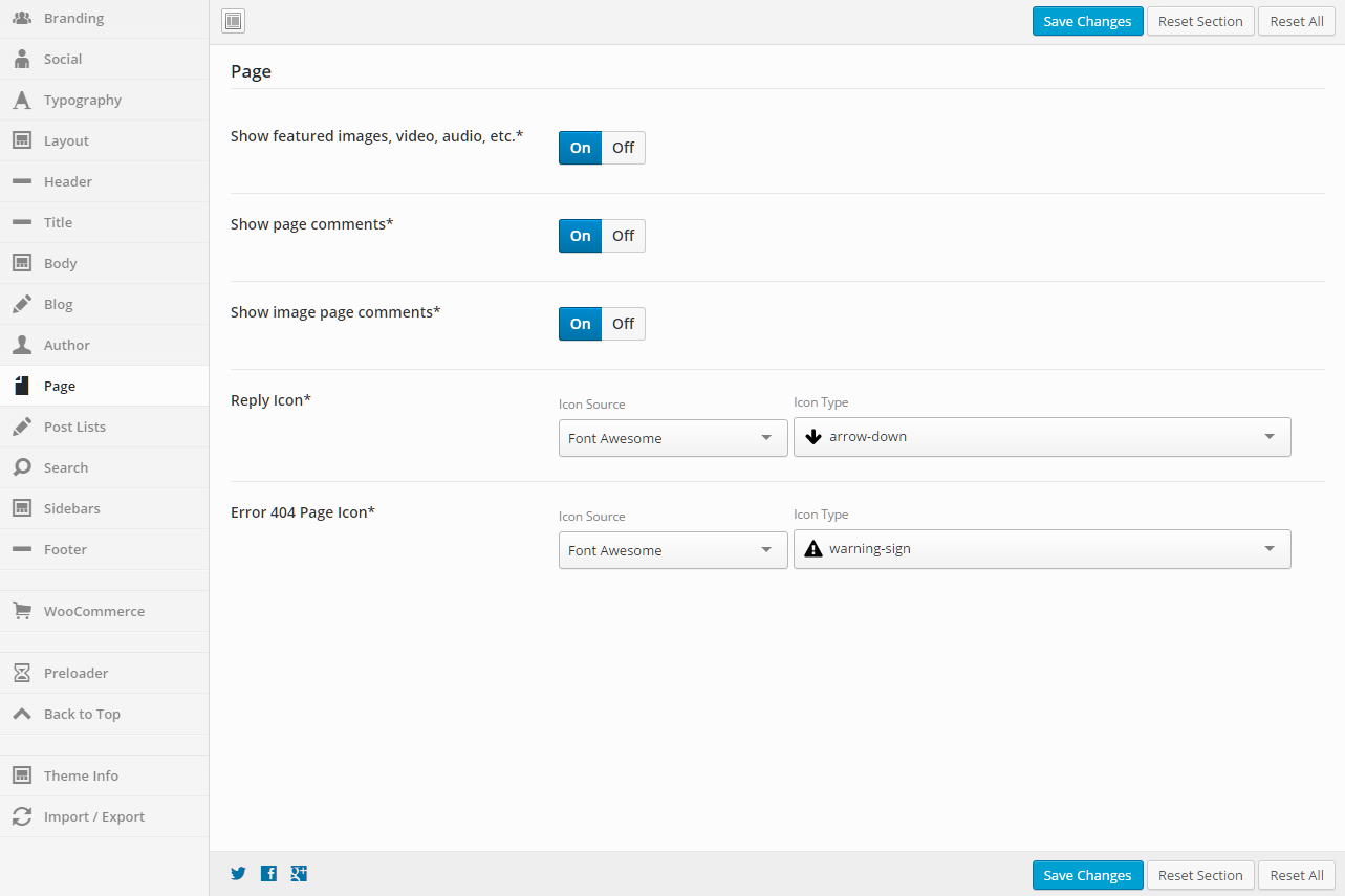
General

Show
Set this option to “On” if you want to show the Back To Top button.
Show on Mobile
Set this option to “On” if you want to show the Back To Top button on mobile devices .
Background Color
Set a background color for the button.
Icon Color
Set the icon color for the button.
Icon
Set the icon to be used for the Back to Top button.
Select an Icon Source, then the Icon Type will be populated.
Border Radius
Set a value for the border radius of the button (50% will make the button a circle).
%, em, px – examples: 25% or 10em or 20px
Show Animation
Set the animation that happens when the button is shown.
Hide Animation
Set the animation that happens when the button is hidden.
Scroll Height
Set the amount of pixels srolled before the button is shown.

Position

Top
Set the number of pixels from the top that you want to place the button.
%, em, px – examples: 25% or 10em or 20px
Bottom
Set the number of pixels from the bottom that you want to place the button.
%, em, px – examples: 25% or 10em or 20px
Left
Set the number of pixels from the left that you want to place the button.
%, em, px – examples: 25% or 10em or 20px
Right
Set the number of pixels from the right that you want to place the button.
%, em, px – examples: 25% or 10em or 20px

Social

This section defines social media links and settings. Enter a link that you want to use for the social network icon. If left blank, no icon will be shown.

General

Display Order
Reorder the items however you want by clicking on the “direction arrow” and dragging the item to the location that you want it. These social items are found in the header and footer.
Default Header Color
This option will set the default color of all the social icons in the header. If no colors are set for specific social icons, this color will be used.
Default Header Background Color
This option will set the default background color of all the social icons in the header. If no background colors are set for specific social icons, this color will be used.
Default Footer Color
This option will set the default color of all the social icons in the footer. If no colors are set for specific social icons, this color will be used.
Default Footer Background Color
This option will set the default background color of all the social icons in the footer. If no background colors are set for specific social icons, this color will be used.
Border Radius
This option sets the border radius to be used around each social icon in the header and footer.Leave blank if you do not want a border radius applied.
Social Links Target
Controls how the social links will open when clicked
Social Links Rel
See rel for more information.

The Social and Custom Icon Options shown below apply to all of the following sections found on the Social tab.

  • Email
  • Facebook
  • Google+
  • Instagram
  • LinkedIn
  • Pinterest
  • RSS
  • Twitter
  • YouTube
  • Custom 1
  • Custom 2
  • Custom 3

Social and Custom Icon Options

Link
Put the link to the social site that you are wanting to link to. If you are using the Email link, use mailto (mailto:someone@example.com). An example of a mailto link can be found in the examples here.
Icon
Set the icon that you want to be used. You can select from a number of icon sources. The default is to use the Font Awesome icons.
Header Color
This option will set the color of the social icon in the header. If no color is set, the default color will be used.
Header Background Color
This option will set the background color of the social icon in the header. If no background color is set, the default background color will be used.
Footer Color
This option will set the color of the social icon in the footer. If no color is set, the default color will be used.
Footer Background Color
This option will set the background color of the social icon in the footer. If no background color is set, the default background color will be used.

Import / Export

This section gives you the ability to Import and Export your settings.

Import

Input your settings below and hit Import to restore your options from a backup. WARNING! This will overwrite all existing option values, please proceed with caution!
Data to Import
Select the exported data that you want to now import. The exported data needs to be placed in the theme’s “data” folder in order for it to be shown in the dropdown.
Options/Posts to Import from above export file
Select all options that you want to import.

Export

Here you can copy your current option settings. Keep this safe as you can use it as a backup should anything go wrong, or you can use it to restore your settings on this site (or any other site).
Export Options/Posts
Select all options that you want to export.

Typography

This section gives you the ability to control all aspects of the typography on your website.

General

Body
Font Family – Set the font family for the text
Backup Font Family – Use this font if the main Font Family cannot be found
Font Weight & Style – Set the font weight (bold, normal, etc…)
Font Size – Set the font size for the text
Line Height – Set the font line height for the text
Font Color – Set the font color for the text

Header Tags

H1 – H6
Font Family – Set the font family for the text
Backup Font Family – Use this font if the main Font Family cannot be found
Font Weight & Style – Set the font weight (bold, normal, etc…)
Text Align – Set this option to align the text
Text Transform – Set this option to transform the text (uppercase, lowercase, etc…)
Font Size – Set the font size for the text
Line Height – Set the font line height for the text
Font Color – Set the font color for the text

Links

Link, Link Hover
Font Family – Set the font family for the text
Font Weight & Style – Set the font weight (bold, normal, etc…)
Text Decoration – Set this to add decorations to links (underline, line-through, etc…)
Font Size – Set the font size for the text
Line Height – Set the font line height for the text
Font Color – Set the font color for the text

Posts, Pages, and Other Content

Blog Metadata
Font Family – Set the font family for the text
Backup Font Family – Use this font if the main Font Family cannot be found
Font Weight & Style – Set the font weight (bold, normal, etc…)
Font Size – Set the font size for the text
Line Height – Set the font line height for the text
Font Color – Set the font color for the text
Pagination
Font Family – Set the font family for the text
Font Weight & Style – Set the font weight (bold, normal, etc…)
Font Size – Set the font size for the text
Line Height – Set the font line height for the text
Font Color – Set the font color for the text

Header

Header Menu Top Level
Font Family – Set the font family for the text
Font Weight & Style – Set the font weight (bold, normal, etc…)
Font Size – Set the font size for the text
Line Height – Set the font line height for the text
Font Color – Set the font color for the text
Header Menu Secondary Level
Font Family – Set the font family for the text
Font Weight & Style – Set the font weight (bold, normal, etc…)
Font Size – Set the font size for the text
Line Height – Set the font line height for the text
Font Color – Set the font color for the text
Secondary Header
Font Family – Set the font family for the text
Font Weight & Style – Set the font weight (bold, normal, etc…)
Font Size – Set the font size for the text
Line Height – Set the font line height for the text
Font Color – Set the font color for the text
Secondary Header Menu Top Level
Font Family – Set the font family for the text
Font Weight & Style – Set the font weight (bold, normal, etc…)
Font Size – Set the font size for the text
Line Height – Set the font line height for the text
Font Color – Set the font color for the text
Title
Font Family – Set the font family for the text
Backup Font Family – Use this font if the main Font Family cannot be found
Font Weight & Style – Set the font weight (bold, normal, etc…)
Text Align – Set this option to align the text
Text Transform – Set this option to transform the text (uppercase, lowercase, etc…)
Font Size – Set the font size for the text
Line Height – Set the font line height for the text
Font Color – Set the font color for the text
Tagline
Font Family – Set the font family for the text
Font Weight & Style – Set the font weight (bold, normal, etc…)
Font Size – Set the font size for the text
Line Height – Set the font line height for the text
Font Color – Set the font color for the text

Title

Title
Font Family – Set the font family for the text
Backup Font Family – Use this font if the main Font Family cannot be found
Font Weight & Style – Set the font weight (bold, normal, etc…)
Font Size – Set the font size for the text
Line Height – Set the font line height for the text
Font Color – Set the font color for the text
Breadcrumb
Font Family – Set the font family for the text
Font Weight & Style – Set the font weight (bold, normal, etc…)
Font Size – Set the font size for the text
Line Height – Set the font line height for the text
Font Color – Set the font color for the text

Sidebar

Widget Heading
Font Family – Set the font family for the text
Font Weight & Style – Set the font weight (bold, normal, etc…)
Text Align – Set this option to align the text
Font Size – Set the font size for the text
Line Height – Set the font line height for the text
Font Color – Set the font color for the text

Footer

Footer
Font Family – Set the font family for the text
Font Weight & Style – Set the font weight (bold, normal, etc…)
Font Size – Set the font size for the text
Line Height – Set the font line height for the text
Font Color – Set the font color for the text
Footer Menu
Font Family – Set the font family for the text
Font Weight & Style – Set the font weight (bold, normal, etc…)
Font Size – Set the font size for the text
Line Height – Set the font line height for the text
Font Color – Set the font color for the text
Secondary Footer
Font Family – Set the font family for the text
Font Weight & Style – Set the font weight (bold, normal, etc…)
Font Size – Set the font size for the text
Line Height – Set the font line height for the text
Font Color – Set the font color for the text
Secondary Footer Menu
Font Family – Set the font family for the text
Font Weight & Style – Set the font weight (bold, normal, etc…)
Font Size – Set the font size for the text
Line Height – Set the font line height for the text
Font Color – Set the font color for the text
Widget Heading
Font Family – Set the font family for the text
Font Weight & Style – Set the font weight (bold, normal, etc…)
Text Align – Set this option to align the text
Font Size – Set the font size for the text
Line Height – Set the font line height for the text
Font Color – Set the font color for the text

Custom Font 1 & Custom Font 2

OpenType (.otf)
Upload your own OpenType font. These fonts have a .otf file extension.
Embedded OpenType (.eot)
Upload your own Embedded OpenType font. These fonts have a .eot file extension.
TrueType (.ttf)
Upload your own TrueType font. These fonts have a .ttf file extension.
Web Open Font Format (.woff)
Upload your own Web Open Font Format font. These fonts have a .woff file extension.
Web Open Font Format 2.0 (.woff2)
Upload your own Web Open Font Format 2.0 font. These fonts have a .woff2 file extension.
Scalable Vector Graphics (.svg)
Upload your own Scalable Vector Graphics font. These fonts have a .svg file extension.

Layout

This section gives you the ability to control the layout of your website, including responsive breakpoints, content widths, margins, paddings, and sidebar widths.

General

Layout Mode
Full or boxed width for body content
Full width allows the content to extend the entire browser width. With full width, content sections can be used to box the content. If you want the content to always be boxed, then choose boxed.
Margin
Top – Set this option to add a top margin (measured in pixels)
Bottom – Set this option to add a bottom margin (measured in pixels)

Left/Right Header Width

Width (px)
The width of the left/right header (default is 300px)
Responsive Breakpoint (px)
The responsive breakpoint used to switch to the mobile header. Should be set to about 800-900px more than the header width (default is 1025px)

Content Width

Extra Small Devices (px or %)
The width of the content container when viewed on extra small devices (less than 768px wide)
Small Devices (px or %)
The width of the content container when viewed on small devices (768px to 991px wide)
Medium Devices (px or %)
The width of the content container when viewed on medium devices (992px to 1199px wide)
Large Devices (px or %)
The width of the content container when viewed on large devices (greater than 1199px wide)

Intensity uses a 12 column grid system. Below you can pick how many columns to use for the sidebars when they are enabled. The size of the content area will be calculated based on the number of columns left over. If there are zero or less columns left over, the content will be a full 12 columns wide.

For example, if the left and right sidebars are enabled and set to size 3, then the content will be “total number of columns” – “left sidebar columns” – “right sidebar columns” or 12 – 3 – 3 = 6 columns wide.

The following options are the same for both the right and left sidebars, so the options are only being listed once, but you can control both sidebars in Intensity.

Left/Right Sidebar

Extra Small Devices
Pick the number of columns to use when viewing the site on extra small devices.
Small Devices
Pick the number of columns to use when viewing the site on small devices.
Medium Devices
Pick the number of columns to use when viewing the site on medium devices.
Large Devices
Pick the number of columns to use when viewing the site on large devices.
Padding
Top – Set this option to add a top margin (measured in pixels)
Right- Set this option to add a right margin (measured in pixels)
Bottom – Set this option to add a bottom margin (measured in pixels)
Left – Set this option to add a left margin (measured in pixels)

Header

This section gives you the ability to control nearly all things related to the header. You can choose the layout of the header, the template that is being used, and all sorts of color and border options.

General

Display Mode
Static – stays at the top of the page and not the viewport. When scrolled, the header may be scrolled out of view.
Fixed – keeps the header fixed to the top of the screen. When scrolled, the header will not move but will remain visible.
Show/Hide – hides the header when scrolling down. Show the header when the user scrolls up.
Shrink – shrinks the header and keeps it visible on the screen as the user scrolls.
Custom – like the show/hide option but you set your own custom CSS classes to apply instead of hiding and showing.
Show Animation
Set a “show” animation for the header. This animation will take place when the header is loaded.
Hide Animation
Set a “hide” animation for the header. This animation will take place when the header is hidden during scrolling. This applies to the “Show/Hide” display mode only.
Sections
Check each of the sections that you want to show in the header. Not all the sections may apply to all the header templates.
Columns
Set the number of columns you want the header to be. This may not apply to all the header templates.
Opacity
Set the opacity for the header. Default is 100 (0 is completely transparent, 100 is solid).
Scroll Opacity
Set this option to control the opacity of the header when visible and scrolling. This applies to the “Fixed” and “Shrink” display modes only.
Default is 95 (0 is completely transparent, 100 is solid).
Over Content Opacity
Set this option to control the opacity when the menu is set to be on top of the content.
Default is 80 (0 is completely transparent, 100 is solid).
Shadow
Set this option to add a shadow beneath the header. There are a number of shadows to choose from. The default is no shadow.

Primary Header – General

Template
This option allows you to select a template for the header. There are a number of templates included with Intensity, but you can also create your own. See Creating Content > Templates for more information.

Primary Header – Style

Background
This option allows the control of the header background. You can set the color, transparency, repeat, size, attachment, position, and image for the background of the header. More information on these settings can be found here.

Primary Header – Layout

Full or Boxed
Full or boxed width for header content
Full width allows the content to extend the entire browser width. With full width, content sections can be used to box the content. If you want the content to always be boxed, then choose boxed.
Padding
Top – Set this option to add a top padding (measured in pixels)
Right- Set this option to add a right padding (measured in pixels)
Bottom – Set this option to add a bottom padding (measured in pixels)
Left – Set this option to add a left padding (measured in pixels)
Logo Margin
Top – Set this option to add a top margin (measured in pixels)
Right- Set this option to add a right margin (measured in pixels)
Bottom – Set this option to add a bottom margin (measured in pixels)
Left – Set this option to add a left margin (measured in pixels)
Navigation Margin
Top – Set this option to add a top margin (measured in pixels)
Right- Set this option to add a right margin (measured in pixels)
Bottom – Set this option to add a bottom margin (measured in pixels)
Left – Set this option to add a left margin (measured in pixels)

Primary Header – Border

Top
Set the different values for the border: the height in pixels, the type of border (solid, dotted, etc…), and the color
Bottom
Set the different values for the border: the height in pixels, the type of border (solid, dotted, etc…), and the color
Divider
Set the different values for the border: the height in pixels, the type of border (solid, dotted, etc…), and the color
A few of the header templates contain a divider to separate menus or other areas. This setting applies to that divider

Primary Header – Menu

Mobile Responsive
This option controls the mobile responsiveness of the menu. Turn this option on if you want the menu to be mobile responsive and off if you do not.
Icon Before
Set the icon if you want an icon to show in the menu, before each menu item.
Select an Icon Source, then the Icon Type will be populated.
Icon Before Parents Only
Set this option if you want the icon that is set for “Icon Before” above to only be shown for parent menu items.
Icon After
Set the icon if you want an icon to show in the menu, after each menu item.
Select an Icon Source, then the Icon Type will be populated.
Icon After Parents Only
Set this option if you want the icon that is set for “Icon After” above to only be shown for parent menu items.

Primary Header – Top Level

Padding
Top – Set this option to add a top padding (measured in pixels)
Right- Set this option to add a right padding (measured in pixels)
Bottom – Set this option to add a bottom padding (measured in pixels)
Left – Set this option to add a left padding (measured in pixels)
Margin
Top – Set this option to add a top margin (measured in pixels)
Right- Set this option to add a right margin (measured in pixels)
Bottom – Set this option to add a bottom margin (measured in pixels)
Left – Set this option to add a left margin (measured in pixels)
Hover Font Color
Set the hover font color for when you hover over a top level menu item.
Hover Background Color
Set the hover background color for when you hover over a top level menu item.
Active Font Color
Set the active font color for the active menu item.
Active Background Color
Set the active background color for the active menu item.
Active Hover Font Color
Set the active hover font color for when you hover over the active menu item.
Active Hover Background Color
Set the active hover background color for when you hover over the active menu item.
Border
Set a border on top, right, bottom, or left along with style (dotted, dashed, etc…) and color for the top level menu.
Hover Border
Set a border on top, right, bottom, or left along with style (dotted, dashed, etc…) and color for when you hover over the top level menu.

Primary Header – Secondary Level

Hover Font Color
Set the hover font color for when you hover over a secondary level menu item.
Hover Background Color
Set the hover background color for when you hover over a secondary level menu item.

Secondary Header – General

Template
This option allows you to select a template for the secondary header. There are a number of templates included with Intensity, but you can also create your own. See Creating Content > Templates for more information.

Secondary Header – Style

Background
This option allows the control of the secondary header background. You can set the color, transparency, repeat, size, attachment, position, and image for the background of the secondary header. More information on these settings can be found here.

Secondary Header – Layout

Full or Boxed
Full or boxed width for header content
Full width allows the content to extend the entire browser width. With full width, content sections can be used to box the content. If you want the content to always be boxed, then choose boxed.
Padding
Top – Set this option to add a top padding (measured in pixels)
Right- Set this option to add a right padding (measured in pixels)
Bottom – Set this option to add a bottom padding (measured in pixels)
Left – Set this option to add a left padding (measured in pixels)

Secondary Header – Border

Top
Set the different values for the border: the height in pixels, the type of border (solid, dotted, etc…), and the color
Bottom
Set the different values for the border: the height in pixels, the type of border (solid, dotted, etc…), and the color

Title

This section gives you the ability to control nearly all things related to the title. You can choose the layout of the title, the template that is being used, and many other options.

General

Title Bar
Turn this option On to show the title bar and turn it Off to not show the title bar. This value can be overridden at the page or post level.
Background
This option allows the control of the title background. You can set the color, transparency, repeat, size, attachment, position, and image for the background of the title. More information on these settings can be found here.
Full or Boxed
Full or boxed width for header content
Full width allows the content to extend the entire browser width. With full width, content sections can be used to box the content. If you want the content to always be boxed, then choose boxed.
Padding
Top – Set this option to add a top padding (measured in pixels)
Right- Set this option to add a right padding (measured in pixels)
Bottom – Set this option to add a bottom padding (measured in pixels)
Left – Set this option to add a left padding (measured in pixels)
Top Border
Set the different values for the border: the height in pixels, the type of border (solid, dotted, etc…), and the color
Bottom Border
Set the different values for the border: the height in pixels, the type of border (solid, dotted, etc…), and the color
Breadcrumb Prefix Text
Set the text that will show before the breadcrumb. This might be a simple message that says “You are here” or something like that.
Show Breadcrumb on Mobile
If you want the breadcrumb to show on mobile devices, turn this option On, otherwise turn it Off.
Opacity
Set the opacity for the title. Default is 100 (0 is completely transparent, 100 is solid).
Template
This option allows you to select a template for the title. There are a number of templates included with Intensity, but you can also create your own. See Creating Content > Templates for more information.
Template Sections
Check each of the sections that you want to show in the title. Not all the sections may apply to all the title templates.
Shadow
Set this option to add a shadow beneath the title. There are a number of shadows to choose from. The default is no shadow.

Body

This section gives you the ability to control many aspects of the body and body content portion of your site.

General

Background
This option allows the control of the body background. You can set the color, transparency, repeat, size, attachment, position, and image for the background of the body. More information on these settings can be found here.
Padding
Top – Set this option to add a top padding (measured in pixels)
Right- Set this option to add a right padding (measured in pixels)
Bottom – Set this option to add a bottom padding (measured in pixels)
Left – Set this option to add a left padding (measured in pixels)

Content

Background
This option allows the control of the content background. You can set the color, transparency, repeat, size, attachment, position, and image for the background of the content. More information on these settings can be found here.
Navigation/Meta-data Border
Set the different values for the border: the height in pixels, the type of border (solid, dotted, etc…), and the color. This option allows you to set the top and bottom border height as well as the type and color.
Opacity
Set the opacity for the content. Default is 100 (0 is completely transparent, 100 is solid).

Blog

This section defines options related to the display of posts.

General

Blog Page Main Title Text
Set the main title text for the assigned blog page.
Blog Page Title Bar
Set this option to “On” if you want the title bar to show, and “Off” if you do not want it to show.

Blog Meta Data

Show Meta Data About the Post
Set this option to “On” if you want the meta data about the post to show, and “Off” if you do not want it to show.
Show Author
Set this option to “On” if you want the author information to show, and “Off” if you do not want it to show.
Show Author Image
Set this option to “On” if you want the author image to show, and “Off” if you do not want it to show.
Show Date
Set this option to “On” if you want the date to show, and “Off” if you do not want it to show.
Date Format
See Formatting Date and Time for more information. If empty, the ‘Date Format’ on Settings > General panel will be used
Show Categories
Set this option to “On” if you want the categories to show, and “Off” if you do not want them to show.
Show Tags
Set this option to “On” if you want the tags to show, and “Off” if you do not want them to show.
Show Comments
Set this option to “On” if you want the comments to show, and “Off” if you do not want them to show.

Single Page

Image Size
Select the size of the image you want to be used for the single post page. If you do not see an image size that you think will work, you can add your own size in the Intense admin options (Settings->Intense) on the Images tab.
Post Disclaimer
This option allows you to set the disclaimer text to be shown on the website.
Ad Code
If you would like to display an ad, place the code for the ad here.
Show Previous/Next Navigation Above Post
Set this option to “On” if you want the previous/next navigation to show, and “Off” if you do not want them to show.
Show Featured Images, Video, Audio, etc.
Set this option to “On” if you want the featured items to show, and “Off” if you do not want them to show.
Show Post Title Below Featured Media
Set this option to “On” if you want post title to show, and “Off” if you do not want it to show.
Show Post Author Information
Set this option to “On” if you want the author information to show, and “Off” if you do not want it to show.
Show Related Posts
Set this option to “On” if you want the related posts to show, and “Off” if you do not want them to show.
Related Posts Count
Set the number of posts you want to show in the “Related Posts” section.
Related Posts Columns
Set the number of columns to display in the “Related Posts” section.
Related Posts Image Size
Select the size of the image you want to be used for these posts. If you do not see an image size that you think will work, you can add your own size in the Intense admin options (Settings->Intense) on the Images tab.
Show More Posts from the same Category
Set this option to “On” if you want more posts from the same category to show, and “Off” if you do not want them to show.
More Posts Count
Set the number of posts you want to show in the “More Posts” section.
More Posts Columns
Set the number of columns to display in the “More Posts” section.
More Posts Image Size
Select the size of the image you want to be used for these posts. If you do not see an image size that you think will work, you can add your own size in the Intense admin options (Settings->Intense) on the Images tab.
Show Post Comments
Set this option to “On” if you want the post comments to show, and “Off” if you do not want them to show.
Show Previous/Next Navigation Below Post
Set this option to “On” if you want the previous/next navigation to show, and “Off” if you do not want them to show.