Author

This section gives you the ability to control what information is shown about the author on the archive page.

Archive Page

Show Bio
Set this option to “On” if you want the author bio to show, and “Off” if you do not want it to show.
Bio Template
This option allows you to select a template for the author’s bio. There are a number of templates included with Intensity, but you can also create your own. See Creating Content > Templates for more information.

Blog

This section defines options related to the display of posts.

General

Blog Page Main Title Text
Set the main title text for the assigned blog page.
Blog Page Title Bar
Set this option to “On” if you want the title bar to show, and “Off” if you do not want it to show.

Blog Meta Data

Show Meta Data About the Post
Set this option to “On” if you want the meta data about the post to show, and “Off” if you do not want it to show.
Show Author
Set this option to “On” if you want the author information to show, and “Off” if you do not want it to show.
Show Author Image
Set this option to “On” if you want the author image to show, and “Off” if you do not want it to show.
Show Date
Set this option to “On” if you want the date to show, and “Off” if you do not want it to show.
Date Format
See Formatting Date and Time for more information. If empty, the ‘Date Format’ on Settings > General panel will be used
Show Categories
Set this option to “On” if you want the categories to show, and “Off” if you do not want them to show.
Show Tags
Set this option to “On” if you want the tags to show, and “Off” if you do not want them to show.
Show Comments
Set this option to “On” if you want the comments to show, and “Off” if you do not want them to show.

Single Page

Image Size
Select the size of the image you want to be used for the single post page. If you do not see an image size that you think will work, you can add your own size in the Intense admin options (Settings->Intense) on the Images tab.
Post Disclaimer
This option allows you to set the disclaimer text to be shown on the website.
Ad Code
If you would like to display an ad, place the code for the ad here.
Show Previous/Next Navigation Above Post
Set this option to “On” if you want the previous/next navigation to show, and “Off” if you do not want them to show.
Show Featured Images, Video, Audio, etc.
Set this option to “On” if you want the featured items to show, and “Off” if you do not want them to show.
Show Post Title Below Featured Media
Set this option to “On” if you want post title to show, and “Off” if you do not want it to show.
Show Post Author Information
Set this option to “On” if you want the author information to show, and “Off” if you do not want it to show.
Show Related Posts
Set this option to “On” if you want the related posts to show, and “Off” if you do not want them to show.
Related Posts Count
Set the number of posts you want to show in the “Related Posts” section.
Related Posts Columns
Set the number of columns to display in the “Related Posts” section.
Related Posts Image Size
Select the size of the image you want to be used for these posts. If you do not see an image size that you think will work, you can add your own size in the Intense admin options (Settings->Intense) on the Images tab.
Show More Posts from the same Category
Set this option to “On” if you want more posts from the same category to show, and “Off” if you do not want them to show.
More Posts Count
Set the number of posts you want to show in the “More Posts” section.
More Posts Columns
Set the number of columns to display in the “More Posts” section.
More Posts Image Size
Select the size of the image you want to be used for these posts. If you do not see an image size that you think will work, you can add your own size in the Intense admin options (Settings->Intense) on the Images tab.
Show Post Comments
Set this option to “On” if you want the post comments to show, and “Off” if you do not want them to show.
Show Previous/Next Navigation Below Post
Set this option to “On” if you want the previous/next navigation to show, and “Off” if you do not want them to show.

Body

This section gives you the ability to control many aspects of the body and body content portion of your site.

General

Background
This option allows the control of the body background. You can set the color, transparency, repeat, size, attachment, position, and image for the background of the body. More information on these settings can be found here.
Padding
Top – Set this option to add a top padding (measured in pixels)
Right- Set this option to add a right padding (measured in pixels)
Bottom – Set this option to add a bottom padding (measured in pixels)
Left – Set this option to add a left padding (measured in pixels)

Content

Background
This option allows the control of the content background. You can set the color, transparency, repeat, size, attachment, position, and image for the background of the content. More information on these settings can be found here.
Navigation/Meta-data Border
Set the different values for the border: the height in pixels, the type of border (solid, dotted, etc…), and the color. This option allows you to set the top and bottom border height as well as the type and color.
Opacity
Set the opacity for the content. Default is 100 (0 is completely transparent, 100 is solid).

Title

This section gives you the ability to control nearly all things related to the title. You can choose the layout of the title, the template that is being used, and many other options.

General

Title Bar
Turn this option On to show the title bar and turn it Off to not show the title bar. This value can be overridden at the page or post level.
Background
This option allows the control of the title background. You can set the color, transparency, repeat, size, attachment, position, and image for the background of the title. More information on these settings can be found here.
Full or Boxed
Full or boxed width for header content
Full width allows the content to extend the entire browser width. With full width, content sections can be used to box the content. If you want the content to always be boxed, then choose boxed.
Padding
Top – Set this option to add a top padding (measured in pixels)
Right- Set this option to add a right padding (measured in pixels)
Bottom – Set this option to add a bottom padding (measured in pixels)
Left – Set this option to add a left padding (measured in pixels)
Top Border
Set the different values for the border: the height in pixels, the type of border (solid, dotted, etc…), and the color
Bottom Border
Set the different values for the border: the height in pixels, the type of border (solid, dotted, etc…), and the color
Breadcrumb Prefix Text
Set the text that will show before the breadcrumb. This might be a simple message that says “You are here” or something like that.
Show Breadcrumb on Mobile
If you want the breadcrumb to show on mobile devices, turn this option On, otherwise turn it Off.
Opacity
Set the opacity for the title. Default is 100 (0 is completely transparent, 100 is solid).
Template
This option allows you to select a template for the title. There are a number of templates included with Intensity, but you can also create your own. See Creating Content > Templates for more information.
Template Sections
Check each of the sections that you want to show in the title. Not all the sections may apply to all the title templates.
Shadow
Set this option to add a shadow beneath the title. There are a number of shadows to choose from. The default is no shadow.

Intensity Changelog

Intensity | Responsive Multi-Purpose Theme – v1.2.3 (September 11, 2017)

* Added font size and hover color options for social media links in header and footer
* Added Open Graph meta tags for pages and posts
* Fixed a conflict with the preloader and the Autoptomize plugin
* Updated WooCommerce template files


Intensity | Responsive Multi-Purpose Theme – v1.2.2 (September 11, 2017)

* Updated Intense to version 2.9.0
* Updated Visual Composer to version 5.2.1
* Updated LayerSlider WP to version 6.5.8
* Updated Slider Revolution to version 5.4.5.2
* Fixed a typo in the branding settings
* Fixed compatibility issues with WooCommerce 3.0.9


Intensity | Responsive Multi-Purpose Theme – v1.2.1 (May 25, 2017)

* Fixed showing of nested categories in the breadcrumb
* Updated Intense to version 2.8.9
* Updated LayerSlider WP to version 6.5.1
* Updated Slider Revolution to version 5.4.5.1


Intensity | Responsive Multi-Purpose Theme – v1.2.0 (April 25, 2017)

* Updated Slider Revolution to version 5.4.3


Intensity | Responsive Multi-Purpose Theme – v1.1.9 (April 18, 2017)

* Updated Intense to version 2.8.8
* Updated LayerSlider WP to version 6.3.0
* Updated Slider Revolution to version 5.4.1
* Updated Visual Composer to version 5.1.1
* Fixed compatibility issues with WooCommerce 3.0+


Intensity | Responsive Multi-Purpose Theme – v1.1.8 (Feb 7, 2017)

* Updated Intense to version 2.8.7
* Updated LayerSlider WP to version 6.1.0
* Updated Slider Revolution to version 5.3.1.5
* Fixed PHP 7.1 related warnings
* Fixed an issue with the one column team template found in the agency child theme
* Fixed an issue with the two column text only content template found in the political child theme


Intensity | Responsive Multi-Purpose Theme – v1.1.7 (December 6, 2016)

* Updated Advanced Custom Fields (ACF) to the latest version (5.5.1)
* Updated Intense to version 2.8.5
* Updated LayerSlider WP to version 6.0.6
* Updated Slider Revolution to version 5.3.1
* Updated Visual Composer to version 5.0.1


Intensity | Responsive Multi-Purpose Theme – v1.1.6 (November 10, 2016)

* Fixed content section breakout issues with parallax background images
* Updated Advanced Custom Fields (ACF) to the latest version (5.4.8)
* Updated Intense to version 2.8.4
* Updated LayerSlider WP to version 6.0.5


Intensity | Responsive Multi-Purpose Theme – v1.1.5 (November 9, 2016)

* Fixed CSS link for dynamically created CSS files
* Updated LayerSlider WP to version 6.0.3
* Updated Slider Revolution to version 5.3.0.2


Intensity | Responsive Multi-Purpose Theme – v1.1.4 (October 14, 2016)

* Fixed an issue with the way preloader code handles download links
* Updated Intense to version 2.8.2
* Updated Redux Framework to the latest version (3.6.1.3)


Intensity | Responsive Multi-Purpose Theme – v1.1.3 (September 15, 2016)

* Fixed preloader so it doesn’t animate when triggered from the single attachment page or
when downloading a file
* Fixed some margin issues that caused horizontal scrollbars
* Fixed default logo url to use the website’s url if not set.
This also fixes an issue with qtranslate reverting to default language.
* Fixed a compatibility issue with upcoming WordPress version 4.7
* Updated WooCommerce templates
* Updated Intense to version 2.8.1
* Updated Visual Composer to version 4.12.1


Intensity | Responsive Multi-Purpose Theme – v1.1.2 (July 8, 2016)

* Updated LayerSlider WP to version 5.6.9
* Updated Slider Revolution to version 5.2.6
* Updated Visual Composer to version 4.12
* Updated Intense to version 2.8.0
* The above plugins were somehow not updated during packaging of version 1.1.1


Intensity | Responsive Multi-Purpose Theme – v1.1.1 (July 6, 2016)

* Added option to show/hide social links on post pages
* Added Alt Text option for the site logo image
* Added Background Color, Border, and Border Radius options for Secondary level menu
* Updated LayerSlider WP to version 5.6.9
* Updated Slider Revolution to version 5.2.6
* Updated Visual Composer to version 4.12
* Updated Intense to version 2.8.0
* Updated TGM Plugin Activation class to version 2.6.1


Intensity | Responsive Multi-Purpose Theme – v1.1.0 (May 31, 2016)

* Fixed an issue in Intense that was preventing installing of demos
* Updated Redux Framework to the latest version (3.6.0.5)
* Updated Slider Revolution to version 5.2.5.3
* Updated Intense to version 2.7.9


Intensity | Responsive Multi-Purpose Theme – v1.0.9 (May 26, 2016)

* Improved demo installation by separating out steps, improving feedback,
preventing the chance of conflicts with plugins, and adding the ability
to manually FTP upload the demo zip file to the server for installation
* Increased request timeouts for demo import
* Improved overall performance of admin screens
* Fixed issue with saving of template files created with the Templates CPT
* Updated LayerSlider WP to version 5.6.8
* Updated Slider Revolution to version 5.2.5.1
* Updated Intense to version 2.7.8


Intensity | Responsive Multi-Purpose Theme – v1.0.8 (May 3, 2016)

* Fixed broken demo import
* Removed global word-break styling
* Updated LayerSlider WP to version 5.6.6
* Improved overall performance of admin screens


Intensity | Responsive Multi-Purpose Theme – v1.0.7 (April 26, 2016)

* Updated Slider Revolution to version 5.2.5
* Updated Redux Framework to the latest version (3.6.0.1)
* Added child theme’s style.css as another way to add custom CSS
* Fixed menu styling and search button for page/post level saved header menus
* Improved overall performance


Intensity | Responsive Multi-Purpose Theme – v1.0.6 (April 13, 2016)

* Added Welcome tab to theme options to show links and plugins
* Added theme registration to receive automatic updates, support registration, forum access and more
* Added automatic updates. Users will need to manually update to version 1.0.6.
* Added new “Left menu without branding” header template
* Fixed “Branding on left with menu below” header template


Intensity | Responsive Multi-Purpose Theme – v1.0.5 (April 5, 2016)

* Fixed theme check issues
* Fixed bug in several templates when Intense isn’t enabled
* Fixed missing header animation option warning
* Removed unused intensity_after_closing_body action
* Removed Redux notices
* Removed forced activation/deactivation from TGMPA plugins
* Replaced dirname( __FILE__ ) with get_template_directory() in included plugins


Intensity | Responsive Multi-Purpose Theme – v1.0.4 (March 31, 2016)

* Moved wp_footer to just before closing body tag
* Changed site icon check from WP version to wp_site_icon function check
* Removed functions from header and footer templates
* Prefixed functions, actions, and more that weren’t prefixed
* Fixed data validation issues where dynamic data was not properly escaped
* Fixed divide-by-zero issue in multicolumn widget templates
* Replaced system calls for reading/writing files with WP_Filesystem methods
* Consolidated Intro Effect single post templates to reduce space


Intensity | Responsive Multi-Purpose Theme – v1.0.3 (March 22, 2016)

* Fixed importing of custom post types and saved templates
* Updated theme translatable strings so they are now properly escaped
* Removed use of basename() and dirname() functions


Intensity | Responsive Multi-Purpose Theme – v1.0.2 (March 14, 2016)

* Added support for full width mega menus
* Fixed main translation file changing it from .po/.mo to .pot version
* Removed SVG upload capability because it is a potential security risk
* Removed inline styles across templates and theme files
* Refactored code to remove use of global variables
* Refactored shrink header mode
* Omit closing PHP tag on some pages to avoid “Headers already sent” issues


Intensity | Responsive Multi-Purpose Theme – v1.0.1 (March 9, 2016)

* Added support for Easy Digital Downloads
* Added support for Gravity Forms
* Added support for BuddyPress
* Added ‘nogutter’ class to a couple post fullwidth templates
* Added Agency child theme
* Added Brewery child theme
* Added ability to use Template CPT to create Primary Footer and Secondary Footer templates
* Fixed circle image center alignment on one of the author templates
* Fixed a few font size issues


Intensity | Responsive Multi-Purpose Theme – v1.0.0 (February 20, 2016)

* Initial Release

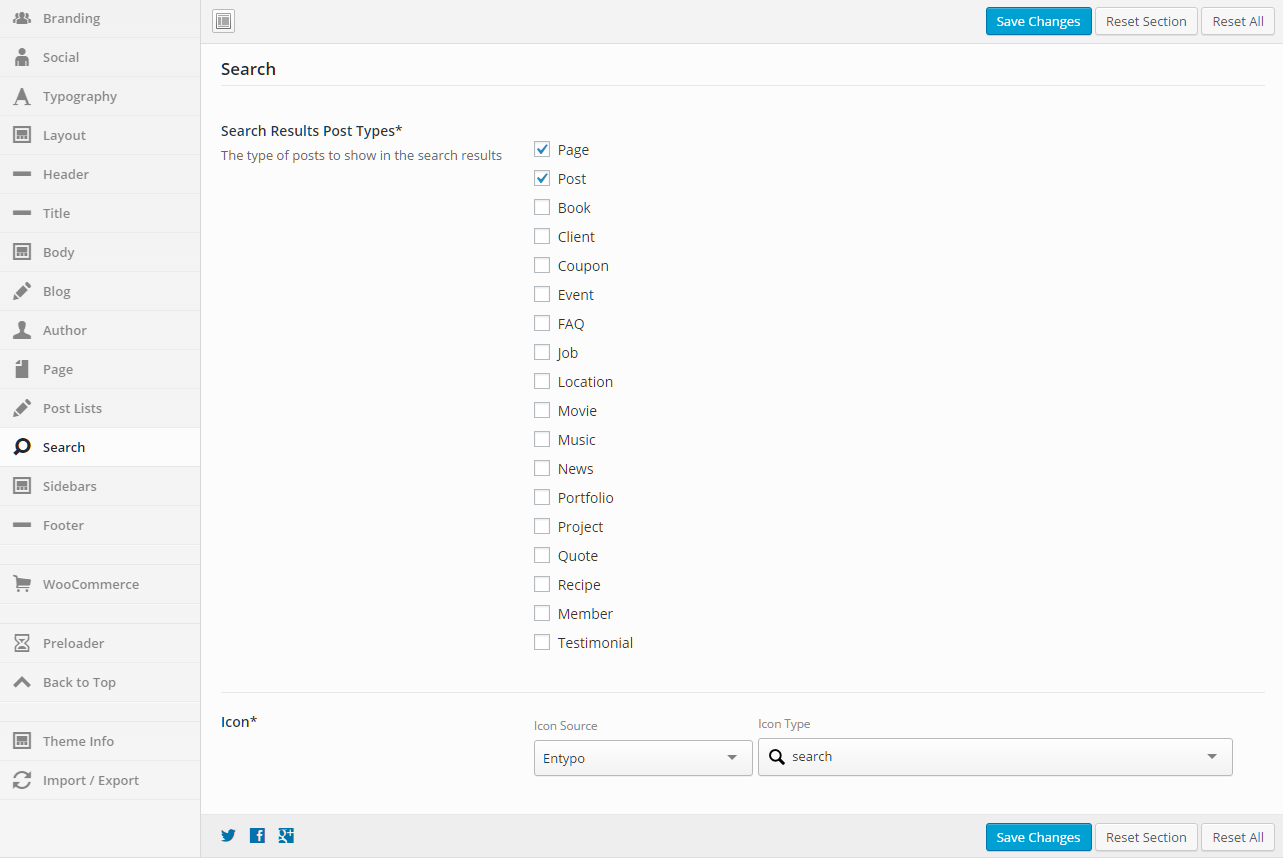
Search

This section gives you the ability to set the post types that will be returned in the search results and also the icon that will be used (default is a magnifying glass).

General

Search Results Post Types
The type of posts to show in the search results
Mark all of the post types that you want to show in the search results.
Icon
Set the icon to be used for the search. This icon is shown next to the menu in many of the Intensity header templates.
Select an Icon Source, then the Icon Type will be populated.

Branding

This section allows you to set your logo and other personal/company information to be used throughout your site. This information may display in the header, footer, widgets, or throughout the site.

Logo

Image
Upload the image that will be used as your logo.
Link
Add in a link so your logo directs to a page of your choice. Leaving blank will make the logo non-clickable. Use the complete url.
Animation In
Add an animation to your logo. This animation will happen once the logo loads (and after the animation delay). Leaving blank will make the logo non-animated.
Animation Delay
Add a delay to the logo animation (in milliseconds).

Site Information

Phone Number
Phone number to show in the header, footer, and throughout the site.
Email
Add in a link so your logo directs to a page of your choice. Leaving blank will make the logo non-Email to show in the header, footer, and throughout the site.
Address
Address to show in the header, footer, and throughout the site.
Copyright Text
The copyright text for your website, typically shown in the footer.

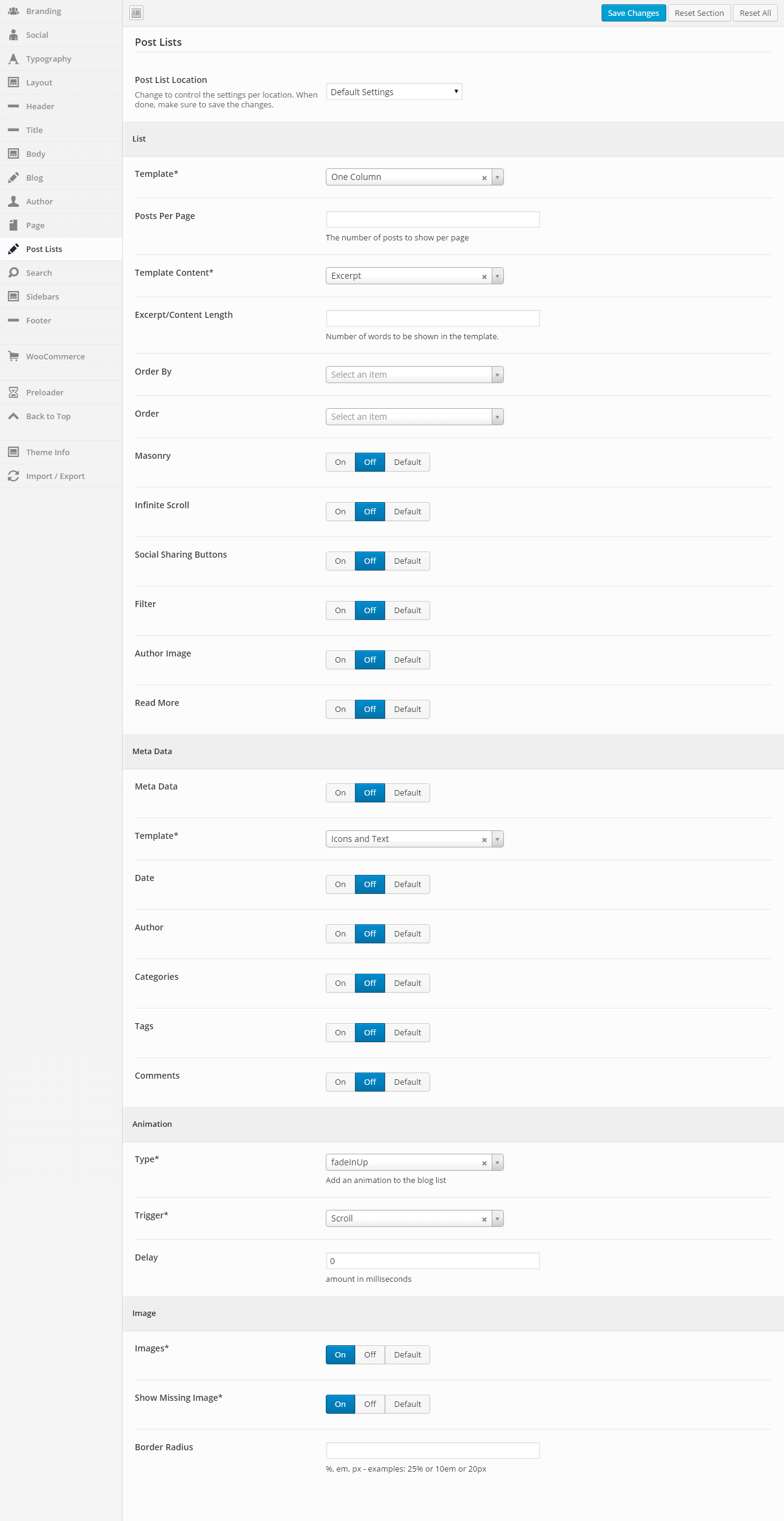
Post Lists

This section gives you the ability to control how post lists are shown for all the various post types and their archive pages as well.

General

Post List Location
Change to control the settings per location. When done, make sure to save the changes. The settings below this dropdown will apply to the post list location that is chosen.

List

Template
This option allows you to select a template for the meta data. There are a number of templates included with Intensity, but you can also create your own. See Creating Content > Templates for more information.
Posts Per Page
Set the number of posts to show per page.
Template Content
Select what type of content you want to be shown in the template. If you choose “Excerpt” or “Content”, you can set the “Excerpt/Content Length” to limit how much is shown. If you choose “Full Post Content”, the entire post will be shown.
Excerpt/Content Length
Set the number of words to be shown in the template.
Order By
Select what you would like to order the list by (typical setting would be “Post ID”)
Order
Select how you would like to order the post list (typical setting would be “Descending”)
Masonry
Set this to “On” if you want a Masonry layout, “Off” if you do not want a Masonry layout, or “Default” if you want to use the setting stored for this option in the “Default Settings” (this is the option “Default Settings” in the “Post List Location” dropdown).
In finite Scroll
Set this to “On” if you want Infinite Scroll, “Off” if you do not want Infinite Scroll, or “Default” if you want to use the setting stored for this option in the “Default Settings” (this is the option “Default Settings” in the “Post List Location” dropdown).
Social Sharing Buttons
Set this to “On” if you want to show the social sharing buttons, “Off” if you do not want to show the social sharing buttons, or “Default” if you want to use the setting stored for this option in the “Default Settings” (this is the option “Default Settings” in the “Post List Location” dropdown).
Filter
Set this to “On” if you want to show the filter, “Off” if you do not want to show the filter, or “Default” if you want to use the setting stored for this option in the “Default Settings” (this is the option “Default Settings” in the “Post List Location” dropdown).
Author Image
Set this to “On” if you want to show the author image, “Off” if you do not want to show the author image, or “Default” if you want to use the setting stored for this option in the “Default Settings” (this is the option “Default Settings” in the “Post List Location” dropdown).
Read More
Set this to “On” if you want to show the Read More button/link, “Off” if you do not want to show the Read More button/link, or “Default” if you want to use the setting stored for this option in the “Default Settings” (this is the option “Default Settings” in the “Post List Location” dropdown).

Meta Data

Meta Data
Set this to “On” if you want to show the meta data, “Off” if you do not want to show the meta data, or “Default” if you want to use the setting stored for this option in the “Default Settings” (this is the option “Default Settings” in the “Post List Location” dropdown).
Template
This option allows you to select a template for the meta data. There are a number of templates included with Intensity, but you can also create your own. See Creating Content > Templates for more information.
Date
Set this to “On” if you want to show the date, “Off” if you do not want to show the date, or “Default” if you want to use the setting stored for this option in the “Default Settings” (this is the option “Default Settings” in the “Post List Location” dropdown).
Author
Set this to “On” if you want to show the author, “Off” if you do not want to show the author, or “Default” if you want to use the setting stored for this option in the “Default Settings” (this is the option “Default Settings” in the “Post List Location” dropdown).
Categories
Set this to “On” if you want to show the categories, “Off” if you do not want to show the categories, or “Default” if you want to use the setting stored for this option in the “Default Settings” (this is the option “Default Settings” in the “Post List Location” dropdown).
Tags
Set this to “On” if you want to show the tags, “Off” if you do not want to show the tags, or “Default” if you want to use the setting stored for this option in the “Default Settings” (this is the option “Default Settings” in the “Post List Location” dropdown).
Comments
Set this to “On” if you want to show the comments, “Off” if you do not want to show the comments, or “Default” if you want to use the setting stored for this option in the “Default Settings” (this is the option “Default Settings” in the “Post List Location” dropdown).

Animation

Type
Add an animation to the blog list.
Trigger
Select the trigger that will initiate the animation (scroll, hover, click, or delay).
Delay
Set this option if you want to delay the animation. The amount is in milliseconds.

Image

Images
Set this to “On” if you want to show images, “Off” if you do not want to show images, or “Default” if you want to use the setting stored for this option in the “Default Settings” (this is the option “Default Settings” in the “Post List Location” dropdown).
Show Missing Image
Set this to “On” if you want to show the missing image, “Off” if you do not want to show the missing image, or “Default” if you want to use the setting stored for this option in the “Default Settings” (this is the option “Default Settings” in the “Post List Location” dropdown).
Border Radius
Set a value for the border radius of the image (50% will make the image a circle if the image is square).
%, em, px – examples: 25% or 10em or 20px

Header

This section gives you the ability to control nearly all things related to the header. You can choose the layout of the header, the template that is being used, and all sorts of color and border options.

General

Display Mode
Static – stays at the top of the page and not the viewport. When scrolled, the header may be scrolled out of view.
Fixed – keeps the header fixed to the top of the screen. When scrolled, the header will not move but will remain visible.
Show/Hide – hides the header when scrolling down. Show the header when the user scrolls up.
Shrink – shrinks the header and keeps it visible on the screen as the user scrolls.
Custom – like the show/hide option but you set your own custom CSS classes to apply instead of hiding and showing.
Show Animation
Set a “show” animation for the header. This animation will take place when the header is loaded.
Hide Animation
Set a “hide” animation for the header. This animation will take place when the header is hidden during scrolling. This applies to the “Show/Hide” display mode only.
Sections
Check each of the sections that you want to show in the header. Not all the sections may apply to all the header templates.
Columns
Set the number of columns you want the header to be. This may not apply to all the header templates.
Opacity
Set the opacity for the header. Default is 100 (0 is completely transparent, 100 is solid).
Scroll Opacity
Set this option to control the opacity of the header when visible and scrolling. This applies to the “Fixed” and “Shrink” display modes only.
Default is 95 (0 is completely transparent, 100 is solid).
Over Content Opacity
Set this option to control the opacity when the menu is set to be on top of the content.
Default is 80 (0 is completely transparent, 100 is solid).
Shadow
Set this option to add a shadow beneath the header. There are a number of shadows to choose from. The default is no shadow.

Primary Header – General

Template
This option allows you to select a template for the header. There are a number of templates included with Intensity, but you can also create your own. See Creating Content > Templates for more information.

Primary Header – Style

Background
This option allows the control of the header background. You can set the color, transparency, repeat, size, attachment, position, and image for the background of the header. More information on these settings can be found here.

Primary Header – Layout

Full or Boxed
Full or boxed width for header content
Full width allows the content to extend the entire browser width. With full width, content sections can be used to box the content. If you want the content to always be boxed, then choose boxed.
Padding
Top – Set this option to add a top padding (measured in pixels)
Right- Set this option to add a right padding (measured in pixels)
Bottom – Set this option to add a bottom padding (measured in pixels)
Left – Set this option to add a left padding (measured in pixels)
Logo Margin
Top – Set this option to add a top margin (measured in pixels)
Right- Set this option to add a right margin (measured in pixels)
Bottom – Set this option to add a bottom margin (measured in pixels)
Left – Set this option to add a left margin (measured in pixels)
Navigation Margin
Top – Set this option to add a top margin (measured in pixels)
Right- Set this option to add a right margin (measured in pixels)
Bottom – Set this option to add a bottom margin (measured in pixels)
Left – Set this option to add a left margin (measured in pixels)

Primary Header – Border

Top
Set the different values for the border: the height in pixels, the type of border (solid, dotted, etc…), and the color
Bottom
Set the different values for the border: the height in pixels, the type of border (solid, dotted, etc…), and the color
Divider
Set the different values for the border: the height in pixels, the type of border (solid, dotted, etc…), and the color
A few of the header templates contain a divider to separate menus or other areas. This setting applies to that divider

Primary Header – Menu

Mobile Responsive
This option controls the mobile responsiveness of the menu. Turn this option on if you want the menu to be mobile responsive and off if you do not.
Icon Before
Set the icon if you want an icon to show in the menu, before each menu item.
Select an Icon Source, then the Icon Type will be populated.
Icon Before Parents Only
Set this option if you want the icon that is set for “Icon Before” above to only be shown for parent menu items.
Icon After
Set the icon if you want an icon to show in the menu, after each menu item.
Select an Icon Source, then the Icon Type will be populated.
Icon After Parents Only
Set this option if you want the icon that is set for “Icon After” above to only be shown for parent menu items.

Primary Header – Top Level

Padding
Top – Set this option to add a top padding (measured in pixels)
Right- Set this option to add a right padding (measured in pixels)
Bottom – Set this option to add a bottom padding (measured in pixels)
Left – Set this option to add a left padding (measured in pixels)
Margin
Top – Set this option to add a top margin (measured in pixels)
Right- Set this option to add a right margin (measured in pixels)
Bottom – Set this option to add a bottom margin (measured in pixels)
Left – Set this option to add a left margin (measured in pixels)
Hover Font Color
Set the hover font color for when you hover over a top level menu item.
Hover Background Color
Set the hover background color for when you hover over a top level menu item.
Active Font Color
Set the active font color for the active menu item.
Active Background Color
Set the active background color for the active menu item.
Active Hover Font Color
Set the active hover font color for when you hover over the active menu item.
Active Hover Background Color
Set the active hover background color for when you hover over the active menu item.
Border
Set a border on top, right, bottom, or left along with style (dotted, dashed, etc…) and color for the top level menu.
Hover Border
Set a border on top, right, bottom, or left along with style (dotted, dashed, etc…) and color for when you hover over the top level menu.

Primary Header – Secondary Level

Hover Font Color
Set the hover font color for when you hover over a secondary level menu item.
Hover Background Color
Set the hover background color for when you hover over a secondary level menu item.

Secondary Header – General

Template
This option allows you to select a template for the secondary header. There are a number of templates included with Intensity, but you can also create your own. See Creating Content > Templates for more information.

Secondary Header – Style

Background
This option allows the control of the secondary header background. You can set the color, transparency, repeat, size, attachment, position, and image for the background of the secondary header. More information on these settings can be found here.

Secondary Header – Layout

Full or Boxed
Full or boxed width for header content
Full width allows the content to extend the entire browser width. With full width, content sections can be used to box the content. If you want the content to always be boxed, then choose boxed.
Padding
Top – Set this option to add a top padding (measured in pixels)
Right- Set this option to add a right padding (measured in pixels)
Bottom – Set this option to add a bottom padding (measured in pixels)
Left – Set this option to add a left padding (measured in pixels)

Secondary Header – Border

Top
Set the different values for the border: the height in pixels, the type of border (solid, dotted, etc…), and the color
Bottom
Set the different values for the border: the height in pixels, the type of border (solid, dotted, etc…), and the color

Meta Options

The following meta options are available on the these post types and custom post types included with Intense. With each of the post types, there are many meta options that are specific to each post type. Please see the Custom Post Types page for additional information on what each post type has for meta options (this is in addition to the options below).

  • Posts – Post Options and Featured Media
  • Books – Post Options only
  • Clients – Post Options and Featured Media
  • Coupons – Post Options and Featured Media
  • Events – Post Options and Featured Media
  • FAQ – Post Options only
  • Jobs – Post Options only
  • Locations – Post Options and Featured Media
  • Movies – Post Options only
  • Music – Post Options only
  • News – Post Options and Featured Media
  • Portfolio – Post Options and Featured Media
  • Projects – Post Options and Featured Media
  • Quotes – Post Options only
  • Recipes – Post Options and Featured Media
  • Team – Post Options and Featured Media
  • Testimonials – Post Options only

See the settings below that are available for both the above mentioned Post Options and Featured Media meta options.

Post Options Metabox

The Post Options metabox controls a number of aspects on your page/post. You can control the layout, header, title, footer, sidebars, background, and any post/page specific code.

Header

Header Display Mode
Static - stays at the top of the page and not the viewport. When scrolled, the header may be scrolled out of view.
Fixed - keeps the header fixed to the top of the screen. When scrolled, the header will not move but will remain visible.
Show/Hide - hides the header when scrolling down. Show the header when the user scrolls up.
Shrink - shrinks the header and keeps it visible on the screen as the user scrolls.
Custom - like the show/hide option but you set your own custom CSS classes to apply instead of hiding and showing.
Header Template
Select the template that you want this page to use for the header. If you chose "Use Default", the default template will be used. This "Default Template" can be set in the Intensity theme options.
Secondary Header Template
Select the template that you want this page to use for the secondary header. If you chose "Use Default", the default template will be used. This "Default Template" can be set in the Intensity theme options.
Header Menu
Select the menu that you want this page to use. If you chose "Use Default", the default menu will be used. This "Default" menu can be set in the Intensity theme options.
Secondary Header Menu
Select the secondary header menu that you want this page to use. If you chose "Use Default", the default menu will be used. This "Default" menu can be set in the Intensity theme options.
Header Sidebar 1
Set the Sidebar to be used.
Header Sidebar 2
Set the Sidebar to be used.
Header Sidebar 3
Set the Sidebar to be used.
Header Sidebar 4
Set the Sidebar to be used.
Secondary Header Sidebar 1
Set the Sidebar to be used.
Secondary Header Sidebar 2
Set the Sidebar to be used.
Secondary Header Sidebar 3
Set the Sidebar to be used.
Secondary Header Sidebar 4
Set the Sidebar to be used.

Title

Show Main Title
Select whether you want the main title to show or not. This is the "Title" section, found just below the menu. If you chose "Use Default", this option is set in the Intensity theme options.
Title Template
Select the template that you want this page to use for the title. If you chose "Use Default", the default template will be used. This "Default Template" can be set in the Intensity theme options. The "title" will only be shown if the "Show Main Title" option on the Layout tab is set to "Show" or the default is to show the title.
Title Text
Set the text to be shown in the Title, the default will be to show the page/post title.
Title Sidebar 1
Set the Sidebar to be used.
Title Sidebar 2
Set the Sidebar to be used.
Title Sidebar 3
Set the Sidebar to be used.
Title Sidebar 4
Set the Sidebar to be used.

Body

Content Position
Select whether you want the content of your page to be behind the menu or below the menu. Your options are "Top, behind menu" or "Below menu".
Padding Top
Set this option to add a top padding (measured in pixels) to the main content area.
Padding Bottom
Set this option to add a bottom padding (measured in pixels) to the main content area.

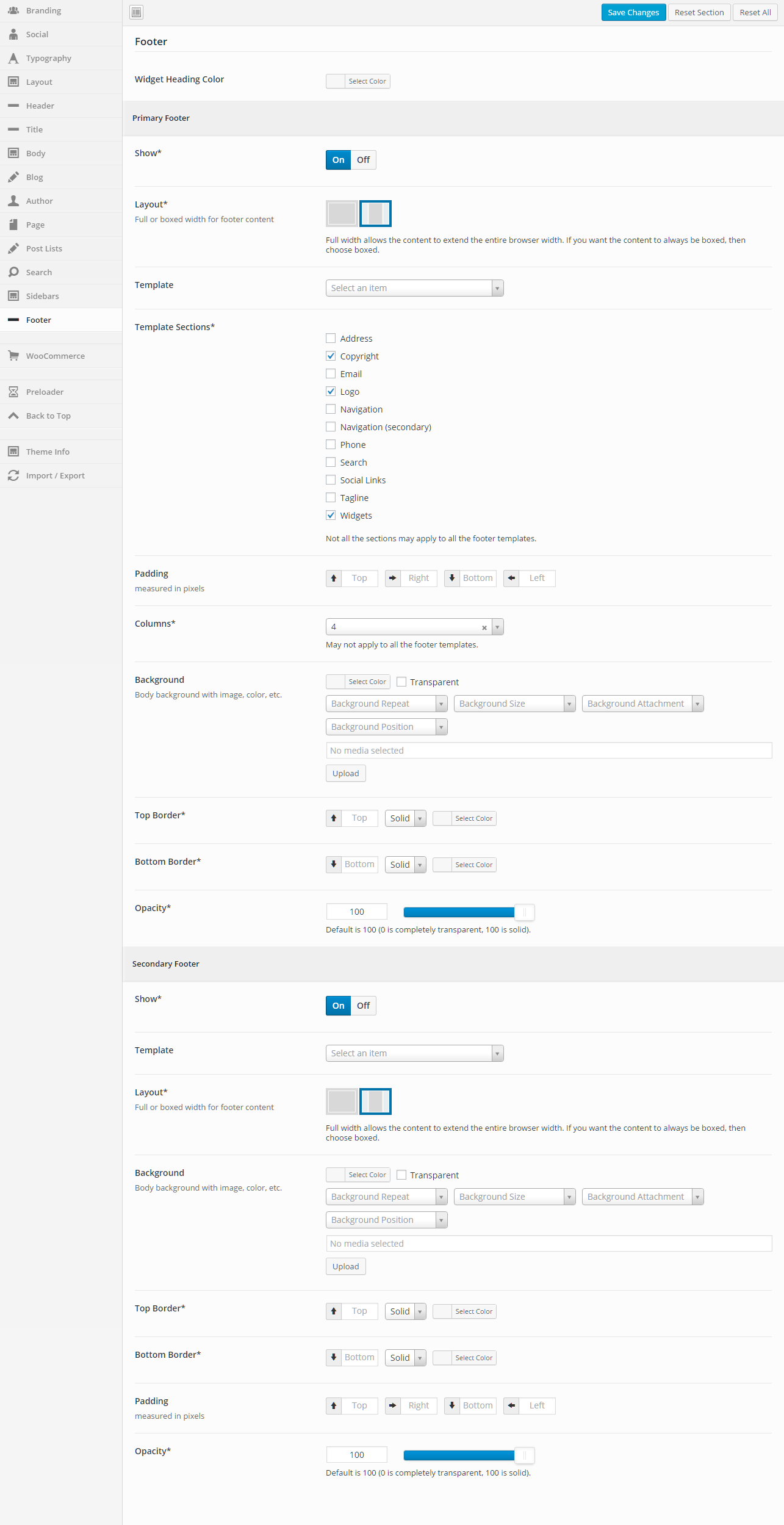
Footer

Footer Template
Select the template that you want this page to use for the footer. If you chose "Use Default", the default template will be used. This "Default Template" can be set in the Intensity theme options.
Show Primary Footer
Select whether you want the primary footer to be shown on the page or not. Your options are "Use Default", "Show", or "Hide".
Show Secondary Footer
Select whether you want the secondary footer to be shown on the page or not. Your options are "Use Default", "Show", or "Hide".
Footer Menu
Select the footer menu that you want this page to use. If you chose "Use Default", the default menu will be used. This "Default" menu can be set in the Intensity theme options.
Footer Sidebar 1
Set the Sidebar to be used.
Footer Sidebar 2
Set the Sidebar to be used.
Footer Sidebar 3
Set the Sidebar to be used.
Footer Sidebar 4
Set the Sidebar to be used.
Secondary Footer Sidebar 1
Set the Sidebar to be used.
Secondary Footer Sidebar 2
Set the Sidebar to be used.
Secondary Footer Sidebar 3
Set the Sidebar to be used.
Secondary Footer Sidebar 4
Set the Sidebar to be used.

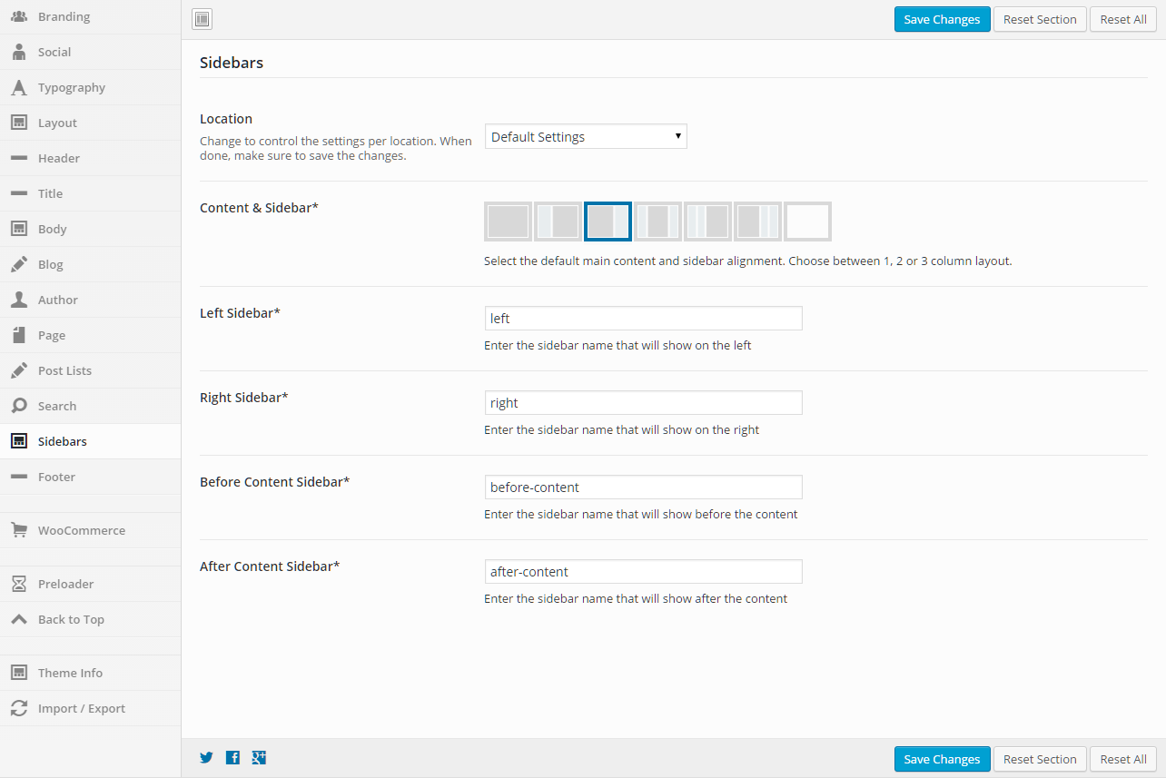
Sidebars

Layout
Select the layout for the sidebars that you want the page to use. Your options are "Use Default", "1 Column", "2 Column Left", "2 Column Right", "3 Column Middle", "3 Column Left", "3 Column Right".
Left
Set the sidebar that you want on the left.
Right
Set the sidebar that you want on the right.
Before Content
Set the sidebar that you want to show before the content.
After Content
Set the sidebar that you want to show after the content.

Background

Color
Select the color that you want to be used for the background of the page.
Image
If you want an image as the background of the page, select the image.
Image Mode
If you selected an image as the background, set the image mode for that image here. Your choices are "Full Screen", "Repeat", "Repeat Horizontally", "Repeat Vertically", or "No Repeat".

Comments

Show Comments
Select whether you want the page/post comments to show or not.
Template
Select the template that you want this page to use for the comments.

Extras

Show Preloader
Select whether you want the preloader to show or not during page load. If you chose "Use Default", this option is set in the Intensity theme options.
CSS Code
If you have page specific CSS, it can be placed here. You do not need to include style tags.
Closing </head> Code
Custom code to add before the closing </head> tag. It will be added as-is and should include any necessary script or html tags.
Closing </body> Code
Custom code to add before the closing </body> tag. It will be added as-is and should include any necessary script or html tags.

Featured Media Metabox

The Featured Media metabox allows you to set the featured media to be shown on the page and also how the media is shown.

Gallery

Featured Gallery
Click the "Add to gallery" button to view the media popup. Select the images that you want to be shown in the gallery. Hit the "Select" button once you have the image(s) selected. If you want to remove an image, hover over the image and click the "X".

Gallery Image Options

Image Type
Select the template that you want this page to use for the header. If you chose "Use Default", the default template will be used. This "Default Template" can be set in the Intensity theme options.
Shadow
Select the template that you want this page to use for the title. If you chose "Use Default", the default template will be used. This "Default Template" can be set in the Intensity theme options. The "title" will only be shown if the "Show Main Title" option on the Layout tab is set to "Show" or the default is to show the title.
Hover Effect Type
Select the template that you want this page to use for the footer. If you chose "Use Default", the default template will be used. This "Default Template" can be set in the Intensity theme options.
Subtle Hover Effect
Select whether you want the primary footer to be shown on the page or not. Your options are "Use Default", "Show", or "Hide".
Effeckt Hover Effect
Select whether you want the primary footer to be shown on the page or not. Your options are "Use Default", "Show", or "Hide".
Caman Effect

*Only visible for Image Type of "Caman".

Start Effect

*Only visible for Image Type of "Adipoli".

Hover Effect

*Only visible for Image Type of "Adipoli".

Splits

*Only visible for Image Type of "Picstrip".

Horizontal Gutter

*Only visible for Image Type of "Picstrip".

Vertical Gutter

*Only visible for Image Type of "Picstrip".

Audio

Audio URL
Enter the URL to the audio file.

Video

Type
Select the type of video. Your options are "WordPress", "Blip.tv", "College Humor", "Flickr", "FunnyOrDie.com", "Hulu", "Qik", "Revision3", "Screenr", "Ted", "Viddler", "Vimeo", "WordPress.tv", or "Youtube".
Video Size
Set the size of the video. Your options are "Auto", "Wide (16:9)", "Standard (4:3)", or "Square (1:1)".
Poster Image
Select an image to be used as the Poster Image. This image will displayed prior to the video starting.
MP4 Video
Select an MP4 video from your media library.
*Only visible for Type of "WordPress".
OGV Video
Select an OGV video from your media library.
*Only visible for Type of "WordPress".
WebM Video
Select an WebM video from your media library.
*Only visible for Type of "WordPress".
Video URL
Set the URL to the video.
*Visible for all Types aside from "WordPress".

Color

Color
Set the color that you want to be used in place of media.