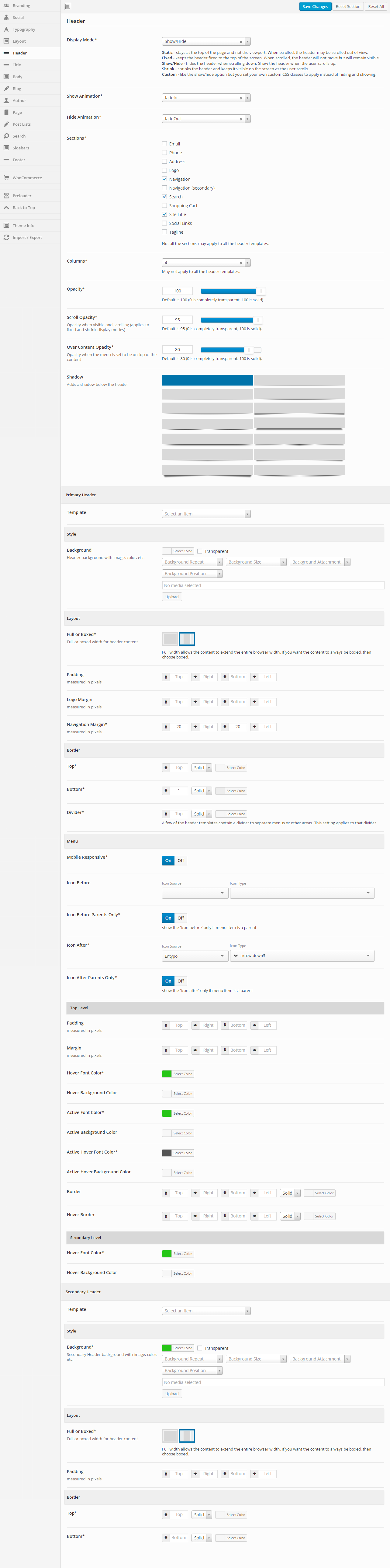
Header
This section gives you the ability to control nearly all things related to the header. You can choose the layout of the header, the template that is being used, and all sorts of color and border options.
General
Display Mode
Static – stays at the top of the page and not the viewport. When scrolled, the header may be scrolled out of view.
Fixed – keeps the header fixed to the top of the screen. When scrolled, the header will not move but will remain visible.
Show/Hide – hides the header when scrolling down. Show the header when the user scrolls up.
Shrink – shrinks the header and keeps it visible on the screen as the user scrolls.
Custom – like the show/hide option but you set your own custom CSS classes to apply instead of hiding and showing.
Show Animation
Set a “show” animation for the header. This animation will take place when the header is loaded.
Hide Animation
Set a “hide” animation for the header. This animation will take place when the header is hidden during scrolling. This applies to the “Show/Hide” display mode only.
Sections
Check each of the sections that you want to show in the header. Not all the sections may apply to all the header templates.
Columns
Set the number of columns you want the header to be. This may not apply to all the header templates.
Opacity
Set the opacity for the header. Default is 100 (0 is completely transparent, 100 is solid).
Scroll Opacity
Set this option to control the opacity of the header when visible and scrolling. This applies to the “Fixed” and “Shrink” display modes only.
Default is 95 (0 is completely transparent, 100 is solid).
Default is 95 (0 is completely transparent, 100 is solid).
Over Content Opacity
Set this option to control the opacity when the menu is set to be on top of the content.
Default is 80 (0 is completely transparent, 100 is solid).
Default is 80 (0 is completely transparent, 100 is solid).
Shadow
Set this option to add a shadow beneath the header. There are a number of shadows to choose from. The default is no shadow.
Primary Header – General
Template
This option allows you to select a template for the header. There are a number of templates included with Intensity, but you can also create your own. See Creating Content > Templates for more information.
Primary Header – Style
Background
This option allows the control of the header background. You can set the color, transparency, repeat, size, attachment, position, and image for the background of the header. More information on these settings can be found here.
Primary Header – Layout
Full or Boxed
Full or boxed width for header content
Full width allows the content to extend the entire browser width. With full width, content sections can be used to box the content. If you want the content to always be boxed, then choose boxed.
Full width allows the content to extend the entire browser width. With full width, content sections can be used to box the content. If you want the content to always be boxed, then choose boxed.
Padding
Top – Set this option to add a top padding (measured in pixels)
Right- Set this option to add a right padding (measured in pixels)
Bottom – Set this option to add a bottom padding (measured in pixels)
Left – Set this option to add a left padding (measured in pixels)
Right- Set this option to add a right padding (measured in pixels)
Bottom – Set this option to add a bottom padding (measured in pixels)
Left – Set this option to add a left padding (measured in pixels)
Logo Margin
Top – Set this option to add a top margin (measured in pixels)
Right- Set this option to add a right margin (measured in pixels)
Bottom – Set this option to add a bottom margin (measured in pixels)
Left – Set this option to add a left margin (measured in pixels)
Right- Set this option to add a right margin (measured in pixels)
Bottom – Set this option to add a bottom margin (measured in pixels)
Left – Set this option to add a left margin (measured in pixels)
Navigation Margin
Top – Set this option to add a top margin (measured in pixels)
Right- Set this option to add a right margin (measured in pixels)
Bottom – Set this option to add a bottom margin (measured in pixels)
Left – Set this option to add a left margin (measured in pixels)
Right- Set this option to add a right margin (measured in pixels)
Bottom – Set this option to add a bottom margin (measured in pixels)
Left – Set this option to add a left margin (measured in pixels)
Primary Header – Border
Top
Set the different values for the border: the height in pixels, the type of border (solid, dotted, etc…), and the color
Bottom
Set the different values for the border: the height in pixels, the type of border (solid, dotted, etc…), and the color
Divider
Set the different values for the border: the height in pixels, the type of border (solid, dotted, etc…), and the color
A few of the header templates contain a divider to separate menus or other areas. This setting applies to that divider
A few of the header templates contain a divider to separate menus or other areas. This setting applies to that divider
Primary Header – Menu
Mobile Responsive
This option controls the mobile responsiveness of the menu. Turn this option on if you want the menu to be mobile responsive and off if you do not.
Icon Before
Set the icon if you want an icon to show in the menu, before each menu item.
Select an Icon Source, then the Icon Type will be populated.
Select an Icon Source, then the Icon Type will be populated.
Icon Before Parents Only
Set this option if you want the icon that is set for “Icon Before” above to only be shown for parent menu items.
Icon After
Set the icon if you want an icon to show in the menu, after each menu item.
Select an Icon Source, then the Icon Type will be populated.
Select an Icon Source, then the Icon Type will be populated.
Icon After Parents Only
Set this option if you want the icon that is set for “Icon After” above to only be shown for parent menu items.
Primary Header – Top Level
Padding
Top – Set this option to add a top padding (measured in pixels)
Right- Set this option to add a right padding (measured in pixels)
Bottom – Set this option to add a bottom padding (measured in pixels)
Left – Set this option to add a left padding (measured in pixels)
Right- Set this option to add a right padding (measured in pixels)
Bottom – Set this option to add a bottom padding (measured in pixels)
Left – Set this option to add a left padding (measured in pixels)
Margin
Top – Set this option to add a top margin (measured in pixels)
Right- Set this option to add a right margin (measured in pixels)
Bottom – Set this option to add a bottom margin (measured in pixels)
Left – Set this option to add a left margin (measured in pixels)
Right- Set this option to add a right margin (measured in pixels)
Bottom – Set this option to add a bottom margin (measured in pixels)
Left – Set this option to add a left margin (measured in pixels)
Hover Font Color
Set the hover font color for when you hover over a top level menu item.
Hover Background Color
Set the hover background color for when you hover over a top level menu item.
Active Font Color
Set the active font color for the active menu item.
Active Background Color
Set the active background color for the active menu item.
Active Hover Font Color
Set the active hover font color for when you hover over the active menu item.
Active Hover Background Color
Set the active hover background color for when you hover over the active menu item.
Border
Set a border on top, right, bottom, or left along with style (dotted, dashed, etc…) and color for the top level menu.
Hover Border
Set a border on top, right, bottom, or left along with style (dotted, dashed, etc…) and color for when you hover over the top level menu.
Primary Header – Secondary Level
Hover Font Color
Set the hover font color for when you hover over a secondary level menu item.
Hover Background Color
Set the hover background color for when you hover over a secondary level menu item.
Secondary Header – General
Template
This option allows you to select a template for the secondary header. There are a number of templates included with Intensity, but you can also create your own. See Creating Content > Templates for more information.
Secondary Header – Style
Background
This option allows the control of the secondary header background. You can set the color, transparency, repeat, size, attachment, position, and image for the background of the secondary header. More information on these settings can be found here.
Secondary Header – Layout
Full or Boxed
Full or boxed width for header content
Full width allows the content to extend the entire browser width. With full width, content sections can be used to box the content. If you want the content to always be boxed, then choose boxed.
Full width allows the content to extend the entire browser width. With full width, content sections can be used to box the content. If you want the content to always be boxed, then choose boxed.
Padding
Top – Set this option to add a top padding (measured in pixels)
Right- Set this option to add a right padding (measured in pixels)
Bottom – Set this option to add a bottom padding (measured in pixels)
Left – Set this option to add a left padding (measured in pixels)
Right- Set this option to add a right padding (measured in pixels)
Bottom – Set this option to add a bottom padding (measured in pixels)
Left – Set this option to add a left padding (measured in pixels)
Secondary Header – Border
Top
Set the different values for the border: the height in pixels, the type of border (solid, dotted, etc…), and the color
Bottom
Set the different values for the border: the height in pixels, the type of border (solid, dotted, etc…), and the color